I'd like to share my thoughts on the RED vs BLUE debate after spending time with both in the last few days. Initially, I went to the dealer and felt very underwhelmed by the BLUE. There was something about it that just didn't feel right, and next to the RED, it felt like it was lacking any feeling or emotion usually felt by a prospective customer buying a new watch - so far many have described the BLUE as 'cold'.
Looking at the two closer, here are my final impressions.
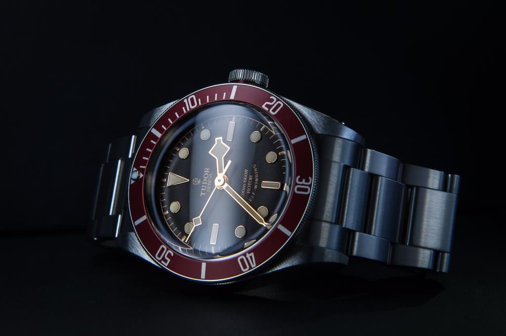
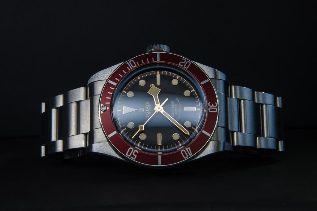
RED
- This is the original model, designed the way Tudor designers intended based on a vintage feel, combined with modern improvements.
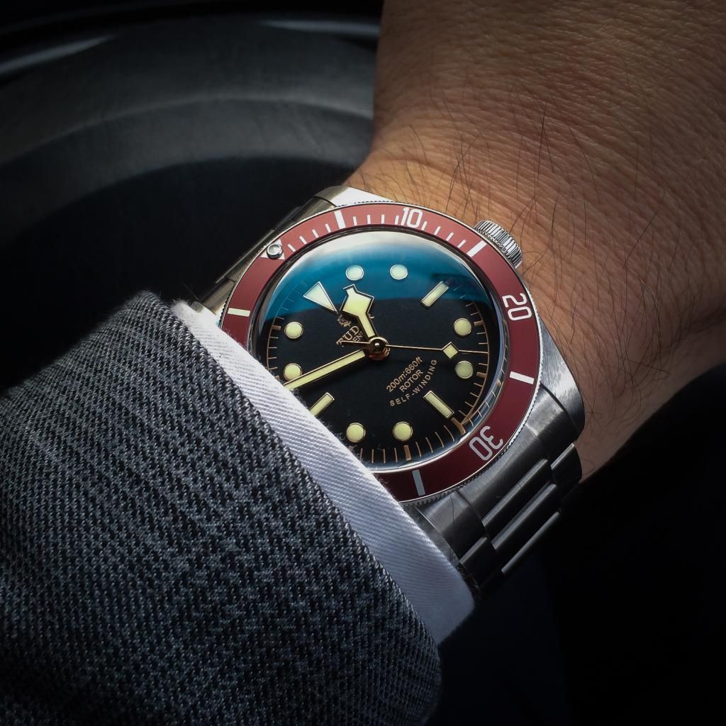
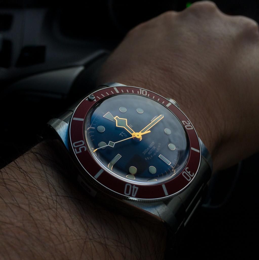
- The red has its own personality and is unequally distinctive to just about all other dive watches ever made. It stands out quite a bit on the wrist due to its matte red bezel and contrasting gold hands. The bezel is more red than maroon as described by some members, but it does change in different light. In daylight it is bright red and indoors it looks more maroonish, but never quite maroon. When looking at this watch from a distance, there is no mistaking it is the Tudor Black Bay, to those WIS.
- The gold hands match beautifully with the lume colour, which looks crème to yellow in different lighting. Combined with the gilt dial chapter ring and minute markers it combines for a match made in heaven. Some members here have described the style as ‘faux’ (false) vintaging due to Tudor's choice of colours, but I disagree with this. Going faux would be using different materials designed to 'mimic' an aged watch, in color, texture and material. Tudor could have achieved this the same way Omega has done with their new Seamaster 300, but instead they just chose a colour of lume that matches well with the hands, similar to the original Sub with red bezel and gold coloured hands.
- The red is a very classy and flashy watch on the wrist, but not overly so. Its really the red that catches attention, more so than the gold hands, which look fantastic and not overly blingy due to the flat surface, as opposed to the two sided hands on other watches.
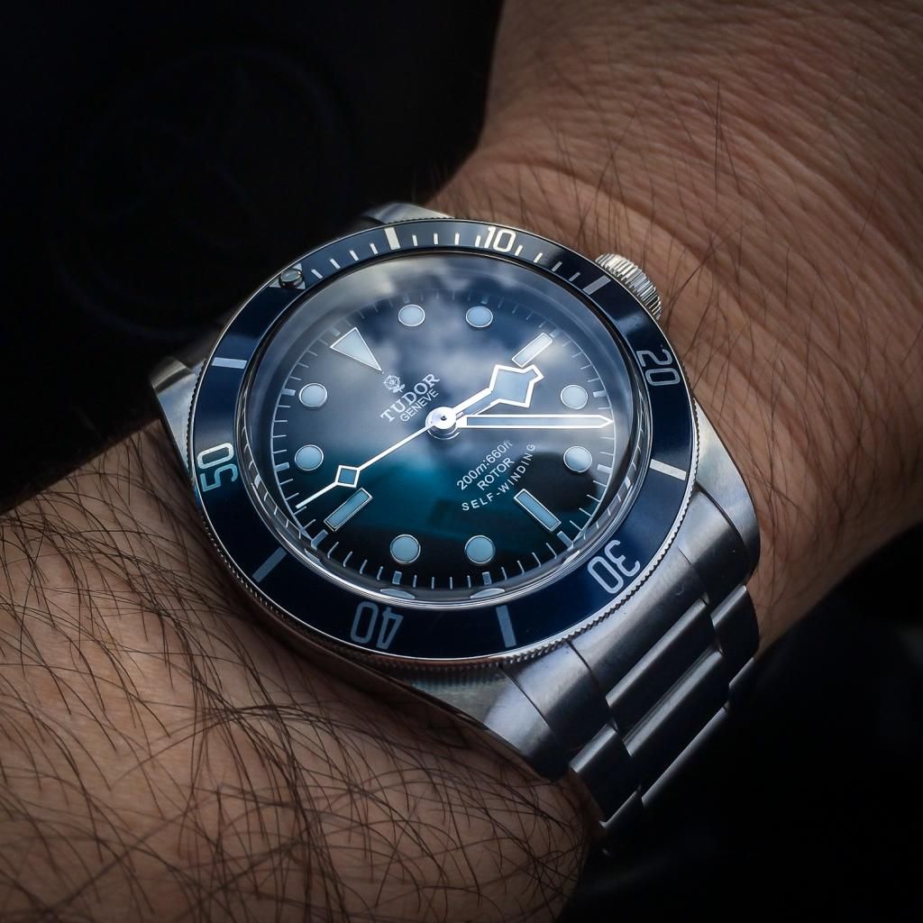
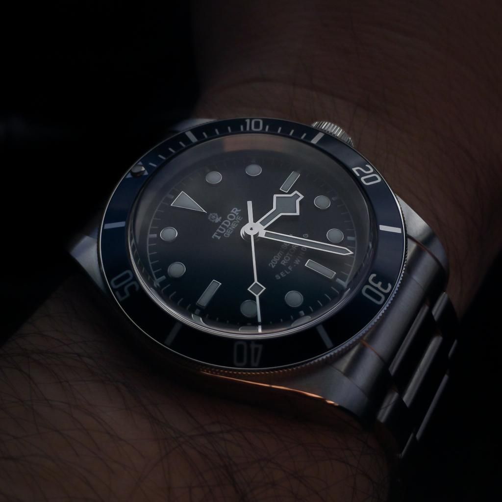
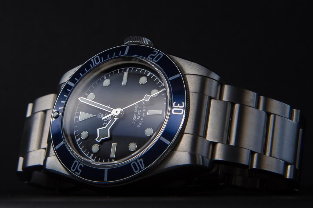
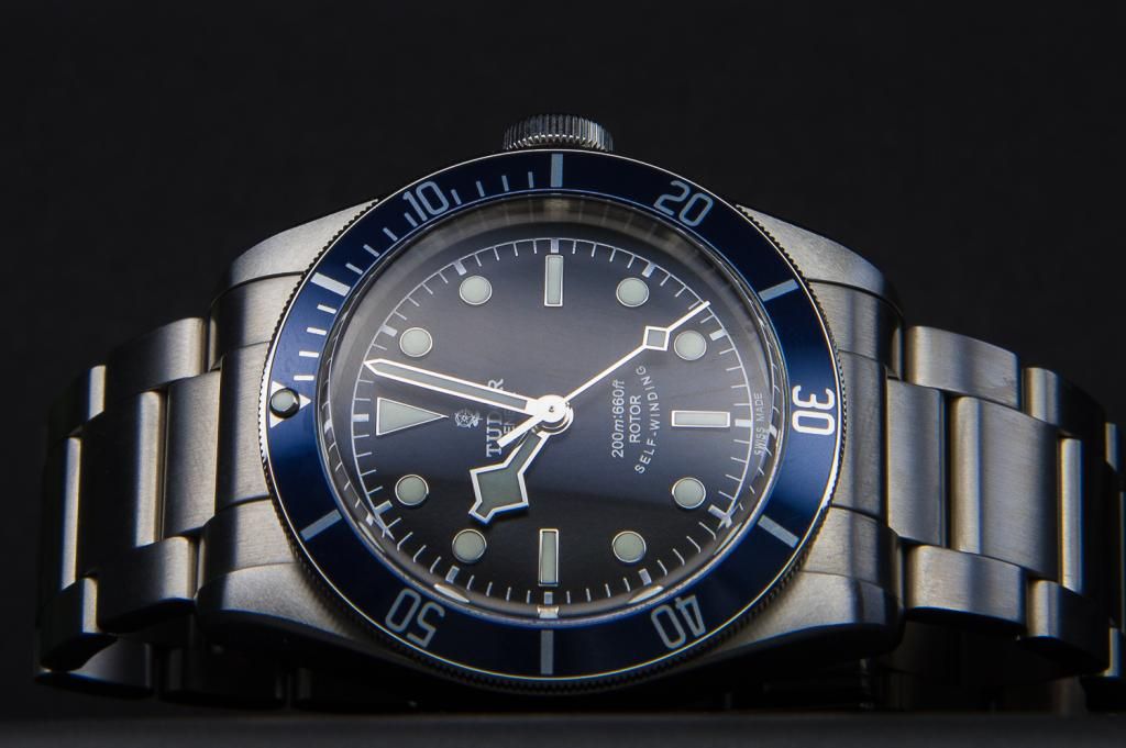
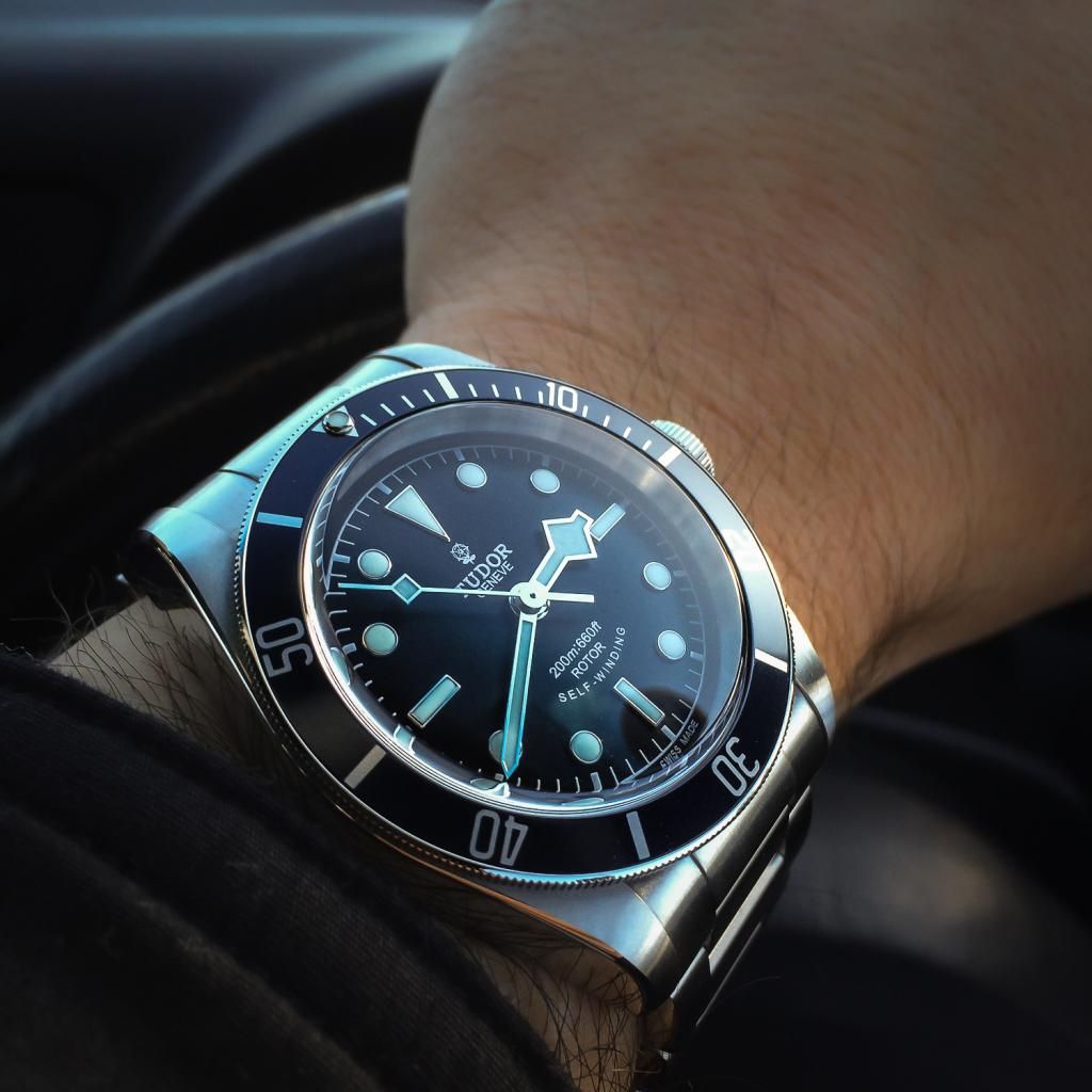
BLUE
- This is a very understated watch. It's completely different to the RED in terms of the way it looks on the wrist and the feelings it evokes. To me, it’s a 'Plain Jane' watch for everyday because it matches just about anything, as the blue is more of a dark, midnight color. From a distance it could be mistaken for any other sports dive watch, so it's not going to grab the attention the RED does.
- The white gold hands looked cheap to me at first, because I was so used to seeing gold hands on this watch, so I have since changed my opinion after spending more time with it and getting used to the color change. The whiter colored lume matches the watch well and make for a nice contrasty dial, and combined with the white gold chapter ring and minute markers, goes very well with the bracelet, which is why many describe this model as looking 'better' than the RED on bracelet....though I would say they look equally as good.
- The bezel on the blue is of a different finish to the matte bezel on the red. It's a more glossy finish that is more reflective and 'blingy'. At first I felt this made it look cheap, but I'm warming up to it now. If it was a matte surface it would surely look darker and the blue tone wouldn’t be so obvious.
- The dial itself is more of a true black compared to the RED’s black/brown color, but really it’s a dark grey matte material. I would have preferred it be pure black to enhance the contrast.

It's important to note that both have a silver internal side that reflects light onto the dial. Due to the gold hands of the RED, its easy to see why the dial can look very warm at times, and with the BLUE having white gold hands, it will look cold at times. This is due to the light bouncing of the sides and catches the colors of the hands and indices’ borders and affecting the color of the dial.
When it comes to legibility, both are about as good as it gets, but I’d give the slight edge to the RED as the lume color is very bright, even in daylight and shade and contrasts better than the whiter lume on the BLUE. At times, I felt the RED’s lume could almost be a little overwhelming in daylight as it turns very yellow against the red bezel, and the colors can be a little overwhelming.
I don't like either of these on straps due to the small gap between the case and strap end. If I was to choose though based on strap, the red's is much nicer, as distressed blue isn't to my liking.
Lastly, I'd like to add that for collectors and those that can live with the RED, that is the one to buy. It's just more special in many ways. The BLUE is great in it's own right and its heritage is substantiated, but it just doesn't have the WOW factor the RED has. So in the end which did I choose? BLUE.....because as my daily watch I just couldn't live with the RED. Later on when I re-build my collection, I will add the RED, no doubt. I hope this helps those having a tough time choosing between these tow brilliant watches.