 |
ROLEXROLEXROLEXROLEXROLEXROLEX
 ROLEXROLEXROLEXROLEXROLEXROLEX
|
|
#1 |
|
"TRF" Member
Join Date: Oct 2011
Location: Space
Posts: 28
|
Different dials on two 116610LN Subs
Hi! I'm new here
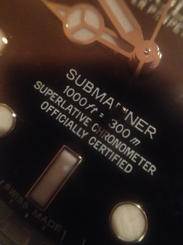
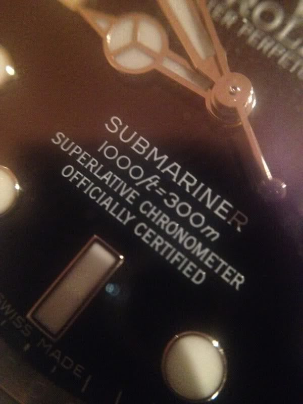
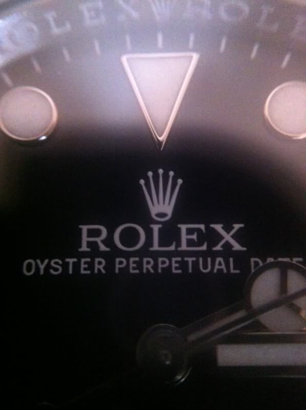
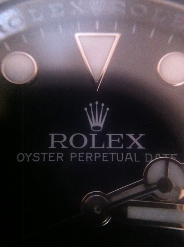
 I had a small GTG with a buddy last night and we compared two 116610LN dials with the Olloclip Macro lens for iPhone and to our big surprise the fonts are different! The warranty card is dated july 2011 on the first watch and december 2011 on the second watch. Look at "ft" letters and the 1 in 1000ft. I'll get another picture of the crown and logo as well which feels bolder on the one compared to the other. I didn't find any info regarding this elsewhere so I was hoping you experts in here could add some info   
|
|
|
|
|
#2 |
|
"TRF" Member
Join Date: Apr 2009
Location: Sea Level
Watch: Varies
Posts: 6,877
|
I didn't know they already had different fonts on the SubC dials.

__________________
 Instagram @z32turbo |
|
|
|
|
#3 |
|
"TRF" Member
Join Date: Jul 2008
Real Name: Chris
Location: England
Posts: 8,148
|
The fonts change subtly over time, different print runs for the text. No big deal

|
|
|
|
|
#4 |
|
"TRF" Member
Join Date: Aug 2006
Real Name: Jim
Location: Earth
Posts: 1,067
|
Also look at the spacing on the m in meters and the numbers 1, they are different. This is normal I believe!
|
|
|
|
|
#5 |
|
"TRF" Member
Join Date: May 2007
Location: Rochester,UK.
Posts: 142
|
Well spotted.
|
|
|
|
|
#6 |
|
"TRF" Member
Join Date: Sep 2008
Real Name: Clive
Location: Exoplanet
Watch: spring-driven
Posts: 38,856
|
Dial font variations have been happening for decades... no big deal at all

__________________

|
|
|
|
|
#7 |
|
2024 Pledge Member
Join Date: Aug 2009
Real Name: Travis
Location: FL / NYC
Watch: Yes..
Posts: 32,218
|
Interesting.
Nice spot.. |
|
|
|
|
#8 |
|
"TRF" Member
Join Date: Oct 2011
Location: Space
Posts: 28
|
 July 2011  December 2011 Check the different size of the "hole" in the crown |
|
|
|
|
#9 |
|
2024 ROLEX DATEJUST41 Pledge Member
Join Date: Sep 2008
Location: North Florida
Posts: 16,593
|
Welcome to the Forum!
Great attention to detail and also....EXCELLENT Pictures!!! |
|
|
|
|
#10 |
|
"TRF" Member
Join Date: Jun 2012
Real Name: Jeroen
Location: Netherlands
Watch: 116610 LV
Posts: 33
|
The 1 and the I's also seem different. Nice pictures btw.
|
|
|
|
|
#11 |
|
"TRF" Member
Join Date: Apr 2011
Location: Norway
Watch: 14060M
Posts: 274
|
Nice.
 Fat font & thin font. Now, let's see some close up's of the logo. 
|
|
|
|
|
#12 |
|
"TRF" Life Patron
Join Date: Jun 2005
Real Name: Peter
Location: Llanfairpwllgwyng
Watch: ing you.
Posts: 52,266
|
Have to agree first it was hologram madness now we have a epidermic of loupe font mania.Its a good job this loupe mania did not go back to the beginning of Rolex watches. As there have been countless tiny font changes over the decades on most Rolex watches.And if forums did exist in those day it would be full of font change posts only.
__________________
 ICom Pro3 All posts are my own opinion and my opinion only. "The clock of life is wound but once, and no man has the power to tell just when the hands will stop. Now is the only time you actually own the time, Place no faith in time, for the clock may soon be still for ever." Good Judgement comes from experience,experience comes from Bad Judgement,.Buy quality, cry once; buy cheap, cry again and again. www.mc0yad.club Second in command CEO and left handed watch winder 
|
|
|
|
|
#13 |
|
"TRF" Member
Join Date: Jan 2011
Location: CA, USA
Watch: Out!!!
Posts: 6,407
|
Just brag that each face is hand-lettered. Different people letter in different fonts.
|
|
|
|
|
#14 |
|
"TRF" Member
Join Date: Apr 2011
Location: canada
Watch: me post!
Posts: 3,804
|
just curious what is the purpose of the font change? to me it really makes no difference which font i own. but clearly rolex has a reason for doing this.
|
|
|
|
|
#15 |
|
"TRF" Member
Join Date: Dec 2009
Location: USA
Posts: 195
|
Looks like someone got gypped on their "f" paint!
|
|
|
|
|
#16 |
|
Banned
Join Date: Jul 2008
Real Name: Wade
Location: TN
Watch: 116619
Posts: 2,659
|
Ok, now someone start a rumor that one font is worth twice as much as the other one and everyone will be running for a loupe

|
|
|
|
|
#17 | |
|
"TRF" Member
Join Date: Jul 2008
Real Name: Chris
Location: England
Posts: 8,148
|
Quote:

|
|
|
|
|
|
#18 | |
|
TRF Moderator & 2024 DATE-JUST41 Patron
Join Date: Dec 2007
Real Name: Ken
Location: SW Florida
Watch: One on my wrist.
Posts: 63,401
|
Quote:

__________________
 SPEM SUCCESSUS ALIT |
|
|
|
|
|
#19 |
|
"TRF" Member
Join Date: Aug 2012
Location: Norway
Posts: 260
|
The version with the softer "ft" font is probably going to become twice as collectable in 40 years. The new redsub. I base this on absolutely nothing.
:p Well spotted mate! (tidssonen.no rules)! |
|
|
|
|
#20 |
|
"TRF" Member
Join Date: Feb 2012
Real Name: John
Location: Florida
Posts: 147
|
Check out the zeros - one looks oval and the other round. "M" is different too.
|
|
|
|
|
#21 |
|
TRF Moderator & 2024 DATE-JUST41 Patron
Join Date: Jul 2007
Real Name: Rob
Location: Nearby.
Posts: 24,903
|
As Chris has stated above, this is not a random case of dial font change, and is simply a re-tool of the printing stamp!!
Every model across the board of the Rolex line-up has in some way or another had a minor font change.....Completely normal! 
__________________
He who wears a Rolex is always on time, even when late!!  TRF's "After Dark" Bar & Nightclub Patron-Founding Member.. |
|
|
|
|
#22 |
|
Member
Join Date: Aug 2011
Location: Michigan
Watch: Submariner LV
Posts: 580
|
yes the zero’s are skinny on one and oval fat on the other nice catch still don’t understand why they changed fonts makes more work is this cost effective?
wow the crown hole is like one for a big head King sized and one for the Prince smaller head? Last edited by ROGERWILCO357; 26 August 2012 at 05:14 PM.. Reason: hole |
|
|
|
|
#23 |
|
"TRF" Member
Join Date: Sep 2010
Real Name: Tom
Location: Lowlands
Watch: White 'n Black
Posts: 641
|
Wel spotted Guybrush, maybe not sp unique, but i didn't notice it and did not know this happens in these 'young' models.
Thanks for sharing! |
|
|
|
|
#24 |
|
"TRF" Member
Join Date: Oct 2011
Location: Australia
Watch: 116610LN
Posts: 15,802
|
Well spotted, but font differences can be found in other Rolex models too, such as the DSSD.
|
|
|
|
|
#25 |
|
"TRF" Member
Join Date: Oct 2011
Location: Space
Posts: 28
|
Yeah, I think that is the coolest about the difference. The Prince Sub-C ;)
|
|
|
|
|
#26 |
|
"TRF" Member
Join Date: Nov 2011
Real Name: Jon
Location: USA
Watch: DJ - Need Sub Bad
Posts: 1,889
|
I know, my Datejust has very thin font letters that make them hard to read from afar. Other Rolexes have the name ROLEX in such big & thick font you can read it across the room.
I don't really care, but I would prefer they be slightly fatter so that I can see them more easily. |
|
|
|
|
#27 | |
|
"TRF" Life Patron
Join Date: Jun 2005
Real Name: Peter
Location: Llanfairpwllgwyng
Watch: ing you.
Posts: 52,266
|
Quote:
__________________
 ICom Pro3 All posts are my own opinion and my opinion only. "The clock of life is wound but once, and no man has the power to tell just when the hands will stop. Now is the only time you actually own the time, Place no faith in time, for the clock may soon be still for ever." Good Judgement comes from experience,experience comes from Bad Judgement,.Buy quality, cry once; buy cheap, cry again and again. www.mc0yad.club Second in command CEO and left handed watch winder 
|
|
|
|
|
|
#28 |
|
"TRF" Member
Join Date: Sep 2010
Real Name: Matte
Location: Toronto
Watch: 16570
Posts: 1,006
|
oh dear. does this mean we'll be having mk 1 mk2 etc etc dials for the newest subs too? hahaha
Best Regards, Matte |
|
|
|
|
#29 |
|
"TRF" Member
Join Date: Aug 2009
Location: USA
Posts: 19,695
|
Minutiae / hype / so-called rarity are at the core of any hobby / collecting activity / etc etc , no?
Watches are no different. It's silly and fun at the same time...we have to be able to laugh at ourselves....Key is not to get sucked in and pay gobs of cash more for a flat "S" short "F" oval "O" sans serif "II" error dial GMT etc etc.... A Red "Submariner" on the other hand.... ;-) |
|
|
|
|
#30 | |
|
"TRF" Member
Join Date: Feb 2011
Location: US
Watch: Sub
Posts: 3,175
|
Quote:

__________________
侘 寂 -- wabi-sabi -- acceptance of transience and imperfection by finding beauty in that which is imperfect, impermanent, and incomplete Commissioner of WEIRD POLICE , Badge # ecsub44 |
|
|
|
 |
| Currently Active Users Viewing This Thread: 1 (0 members and 1 guests) | |
|
|
*Banners
Of The Month*
This space is provided to horological resources.