
|
|
ROLEXROLEXROLEXROLEXROLEXROLEX
 ROLEXROLEXROLEXROLEXROLEXROLEX
 27 August 2012, 04:53 AM
|
#31 | |
|
"TRF" Member

Join Date: Aug 2009
Real Name: Dean
Location: Philippines
Posts: 1,037
|
Quote:

|
|

|
|
27 August 2012, 08:46 AM
|
#32 |
|
Banned
Join Date: Dec 2008
Location: WA
Watch: All the Oysters
Posts: 811
|
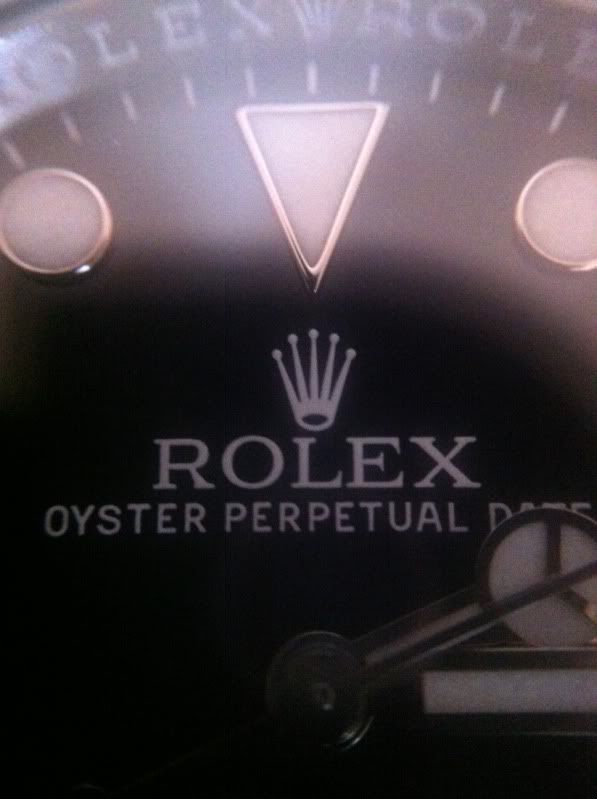
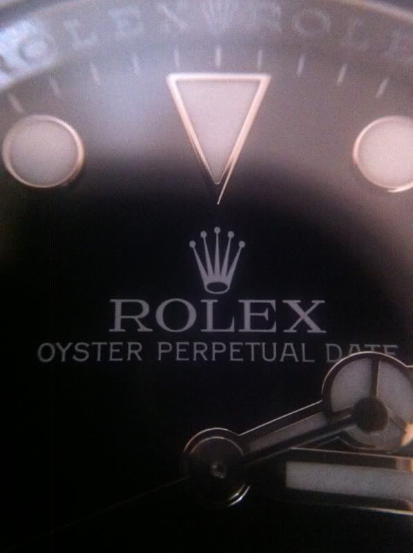
Both dials have been running on the Sub Date for some time...not a big deal, both are legit. That said I strongly prefer the aesthetics of the closely spaced version, with its long "f" and more expressive serifs.
|
|
|
|
27 August 2012, 11:00 AM
|
#33 |
|
"TRF" Member

Join Date: Sep 2007
Real Name: Trevor
Location: Arizona
Posts: 5,740
|
This is so common, Rolex has been doing this forever, no big deal at all.
It is just a different fonts from different machines I guess.
__________________
My grails: 
|
|
|
|
27 August 2012, 12:37 PM
|
#34 |
|
"TRF" Member

Join Date: Aug 2010
Location: Canada
Watch: 116610LN Sub
Posts: 427
|
Mine is like the first photo. Picked it up august 2010
__________________

|
|
|
|
29 August 2012, 03:30 AM
|
#35 | |
|
"TRF" Member

Join Date: Oct 2011
Location: Space
Posts: 28
|
Quote:
|
|
|
|
|
29 August 2012, 03:58 AM
|
#36 |
|
"TRF" Member

Join Date: Dec 2010
Location: US
Watch: 1680 Red & 16622
Posts: 2,449
|
I like the bottom one more, the shorter and wider lettering... but either will do :)
|
|
|
|
6 October 2012, 02:44 AM
|
#37 |
|
"TRF" Member
Join Date: Oct 2011
Location: Space
Posts: 28
|
Anyone else have a newer Sub-C with l000 and not 1000?
|
|
|
|
6 October 2012, 02:50 AM
|
#38 |
|
"TRF" Member

Join Date: Aug 2012
Location: Switzerland
Posts: 14,293
|
I like the long 'f'
|
|
|
|
6 October 2012, 04:57 AM
|
#39 |
|
"TRF" Member

Join Date: Feb 2012
Location: around the world
Watch: 116506
Posts: 1,370
|
I am glad that the in newer the font looks more refined and less "thick"... seems like the subc just keeps getting better and better!!
|
|
|
|
31 October 2012, 04:17 PM
|
#40 |
|
"TRF" Member
Join Date: Oct 2012
Location: Brooklyn NY
Watch: SubC
Posts: 18
|
Damn I thought my watch was different thanks to this forum I'm able to find that my watch is not so different lol
|
|
|
|
9 February 2013, 06:51 AM
|
#41 | |
|
Member
Join Date: Apr 2012
Location: Chicago
Posts: 18
|
Quote:
|
|
|
|
|
9 February 2013, 07:29 AM
|
#42 |
|
"TRF" Member

Join Date: Nov 2012
Location: Slovenia, EU
Watch: BLNR
Posts: 1,507
|
Great catch, you guys must be pilots or something to spot that. :D
|
|
|
|
13 June 2013, 10:41 AM
|
#43 |
|
"TRF" Member
Join Date: Oct 2011
Location: Space
Posts: 28
|
Anyone have a LV with the "l000" font? I have seen several LNs out for sale with "l000" but all the LVs i've seen have "1000"
|
|
|
|
13 June 2013, 11:33 AM
|
#44 |
|
"TRF" Member

Join Date: Jan 2009
Location: Dallas
Watch: 12800ft = 3900m
Posts: 11,172
|
Nice find. There's a lot of differences, seems enough to be the official discovery of the Mark 1 and 2 dials.
Thanks for posting. ...."it's been going on for so long"....except that you actually provided proof. Good job. |
|
|
|
13 June 2013, 11:42 AM
|
#45 |
|
2024 Pledge Member

Join Date: Sep 2009
Real Name: Brian
Location: CA dreamin'
Watch: ing the market.
Posts: 5,900
|
I love the long f.
I'm going to be a nut and let you know that when I bought my new, then long discontinued Sea-Dweller, I specifically wanted a long f dial. I found other new ones, but they were not the dial I wanted. There's a short f SD on the sales corner now. Ultimately I had to drive an hour to an AD that had one in his safe earmarked for someone else. I guess they should have left a bigger deposit... Life is too short to not get what you want, even something as trivial as a font. 
__________________
-Brian AUDENTES FORTUNA IUVAT  十人十色 |
|
|
|
13 June 2013, 12:13 PM
|
#46 | |
|
Banned
Join Date: May 2013
Real Name: John
Location: Florida
Watch: YG President
Posts: 2,090
|
Quote:
|
|
|
|
|
13 June 2013, 02:13 PM
|
#47 | |
|
"TRF" Member
Join Date: Jan 2009
Location: Dallas
Watch: 12800ft = 3900m
Posts: 11,172
|
Quote:
|
|
|
|
|
10 December 2013, 12:59 PM
|
#48 |
|
Banned
Join Date: Nov 2013
Real Name: Anthony
Location: NYC
Posts: 70
|
May want to have a look inside the December sub. Seems all the good canal street subc's have that logo crown and long f. As well and that 1 in the 1000. I'm willing to bet that the font on the bezel is a bit fatter as well.
|
|
|
|
10 December 2013, 01:11 PM
|
#49 |
|
Banned
Join Date: Nov 2013
Real Name: Anthony
Location: NYC
Posts: 70
|
Also, the Mercedes hand is all wonky in the December sub.
|
|
|
|
10 December 2013, 01:54 PM
|
#50 |
|
Banned
Join Date: Feb 2013
Real Name: Bill
Location: Plymouth Meeting
Watch: 116520
Posts: 3,209
|
Don't forget about the difference between "300m" and "300 m." Those two dials show each.
|
|
|
|
10 December 2013, 01:58 PM
|
#51 |
|
"TRF" Member

Join Date: Jan 2011
Real Name: gus
Location: East Coast
Watch: APK & sometimes Y
Posts: 25,996
|
The first one is clearly better

__________________

|
|
|
|
10 December 2013, 02:56 PM
|
#52 |
|
"TRF" Member

Join Date: Aug 2006
Real Name: Scott
Location: GMT -7
Watch: GMT's & Sub's
Posts: 10,399
|
Sorry, but I'll still take a matte dialed, plexi sub vs the modern mark dialed whatever! Just saying.
__________________
"The bitterness of poor quality remains long after the sweetness of lower price is forgotten." -Benjamin Franklin Member No. 922 |
|
|
|
28 November 2015, 08:46 AM
|
#53 |
|
"TRF" Member
Join Date: Jun 2013
Real Name: Stephen
Location: London
Watch: 116610LN
Posts: 115
|
Second logo looks like its the same as the first but just less ink picked up on the transfer pad, or too much was on the first
|
|
|
|
28 November 2015, 11:01 AM
|
#54 | |
|
"TRF" Member
Join Date: Oct 2011
Location: Space
Posts: 28
|
Quote:
|
|
|
|
|
28 November 2015, 02:29 PM
|
#55 |
|
"TRF" Member
Join Date: Nov 2015
Location: North America
Posts: 34
|
very nice catch
|
|
|
|
28 November 2015, 03:32 PM
|
#56 |
|
"TRF" Member
Join Date: Dec 2007
Real Name: Elliott
Location: Prosper, Texas
Watch: Sub 114060 2019
Posts: 410
|
Babe, gas up the car, were going into town to sell the Rolex your uncle Max left us. Its a limited edition because, well because that's all you need to know. Were rich, rich I tell ya. Where's my tuxedo t-shirt, so when we go and sell it, I look like a million bucks? Aw man, I must need a new eyeglass prescription, I thought he left us a Rolex, the jeweler said it was a timex.
|
|
|
|
28 November 2015, 04:50 PM
|
#57 |
|
"TRF" Member

Join Date: Feb 2015
Real Name: Will
Location: Seattle
Watch: out for door jambs
Posts: 85
|
My lv has the 1, not the l.
Has the small holed crown as well. Kind of like the larger holed crown. |
|
|
|
21 January 2017, 11:44 AM
|
#58 |
|
"TRF" Member

Join Date: Jul 2016
Location: Uk
Posts: 29
|
exactly, that's what i thought. i would have thought altering the logo was a no no! why do it anyway?
|
|
|
|
21 January 2017, 12:32 PM
|
#59 |
|
"TRF" Member
Join Date: Jul 2016
Location: Uk
Posts: 29
|
(Swiss made) has been altered also. the s the m and the a are different!
|
|
|
|
21 January 2017, 05:49 PM
|
#60 |
|
"TRF" Member
Join Date: Dec 2016
Location: Chicago
Watch: SubC, GMT
Posts: 248
|
Mine is lOOO. Bought it in Dec 2016
|
|
|
 |
| Currently Active Users Viewing This Thread: 1 (0 members and 1 guests) | |
|
|


*Banners
Of The Month*
This space is provided to horological resources.


 Linear Mode

