
 |
ROLEXROLEXROLEXROLEXROLEXROLEX
 ROLEXROLEXROLEXROLEXROLEXROLEX
|
|
#1 |
|
"TRF" Member
Join Date: Apr 2009
Location: Melbourne
Watch: SEIKO SLA033
Posts: 665
|
Tudor Black Bay RED vs BLUE
I'd like to share my thoughts on the RED vs BLUE debate after spending time with both in the last few days. Initially, I went to the dealer and felt very underwhelmed by the BLUE. There was something about it that just didn't feel right, and next to the RED, it felt like it was lacking any feeling or emotion usually felt by a prospective customer buying a new watch - so far many have described the BLUE as 'cold'.
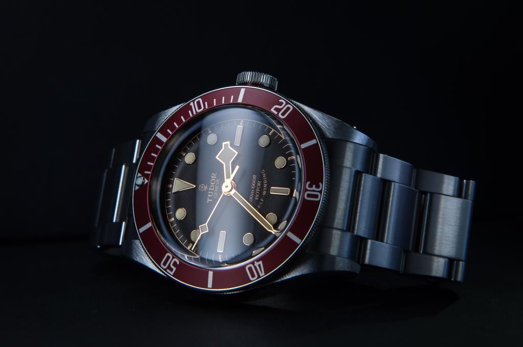 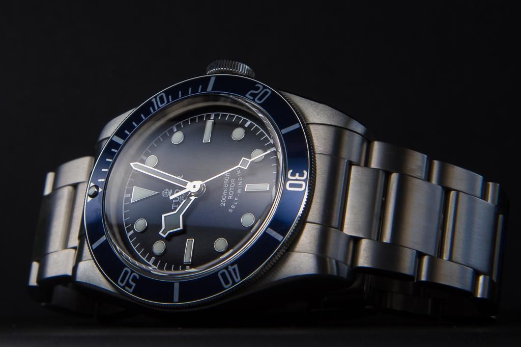 Looking at the two closer, here are my final impressions. RED - This is the original model, designed the way Tudor designers intended based on a vintage feel, combined with modern improvements. - The red has its own personality and is unequally distinctive to just about all other dive watches ever made. It stands out quite a bit on the wrist due to its matte red bezel and contrasting gold hands. The bezel is more red than maroon as described by some members, but it does change in different light. In daylight it is bright red and indoors it looks more maroonish, but never quite maroon. When looking at this watch from a distance, there is no mistaking it is the Tudor Black Bay, to those WIS. - The gold hands match beautifully with the lume colour, which looks crème to yellow in different lighting. Combined with the gilt dial chapter ring and minute markers it combines for a match made in heaven. Some members here have described the style as faux (false) vintaging due to Tudor's choice of colours, but I disagree with this. Going faux would be using different materials designed to 'mimic' an aged watch, in color, texture and material. Tudor could have achieved this the same way Omega has done with their new Seamaster 300, but instead they just chose a colour of lume that matches well with the hands, similar to the original Sub with red bezel and gold coloured hands. - The red is a very classy and flashy watch on the wrist, but not overly so. Its really the red that catches attention, more so than the gold hands, which look fantastic and not overly blingy due to the flat surface, as opposed to the two sided hands on other watches. 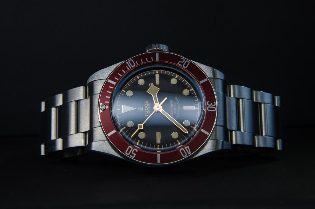 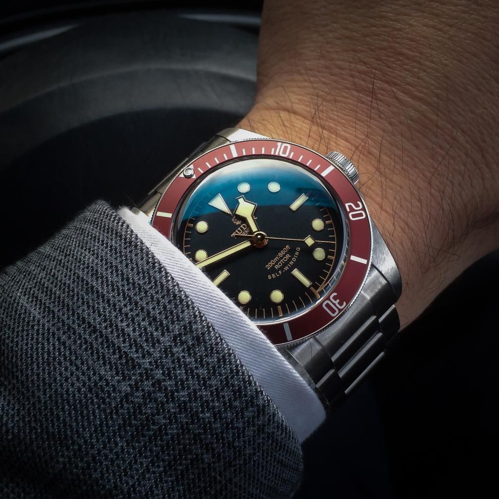 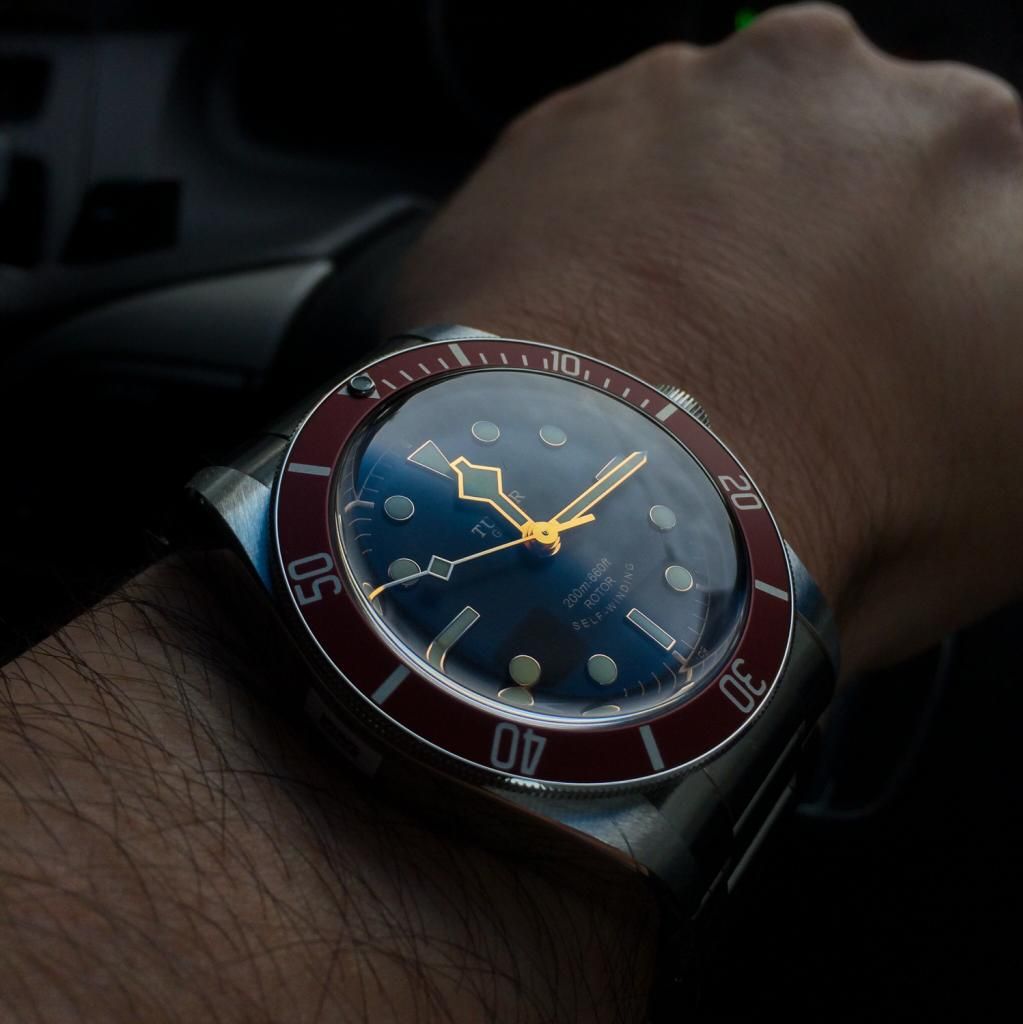 BLUE - This is a very understated watch. It's completely different to the RED in terms of the way it looks on the wrist and the feelings it evokes. To me, its a 'Plain Jane' watch for everyday because it matches just about anything, as the blue is more of a dark, midnight color. From a distance it could be mistaken for any other sports dive watch, so it's not going to grab the attention the RED does. - The white gold hands looked cheap to me at first, because I was so used to seeing gold hands on this watch, so I have since changed my opinion after spending more time with it and getting used to the color change. The whiter colored lume matches the watch well and make for a nice contrasty dial, and combined with the white gold chapter ring and minute markers, goes very well with the bracelet, which is why many describe this model as looking 'better' than the RED on bracelet....though I would say they look equally as good. - The bezel on the blue is of a different finish to the matte bezel on the red. It's a more glossy finish that is more reflective and 'blingy'. At first I felt this made it look cheap, but I'm warming up to it now. If it was a matte surface it would surely look darker and the blue tone wouldnt be so obvious. - The dial itself is more of a true black compared to the REDs black/brown color, but really its a dark grey matte material. I would have preferred it be pure black to enhance the contrast. 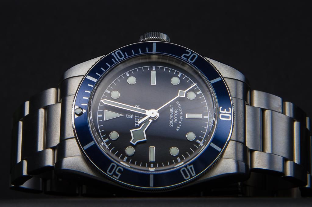  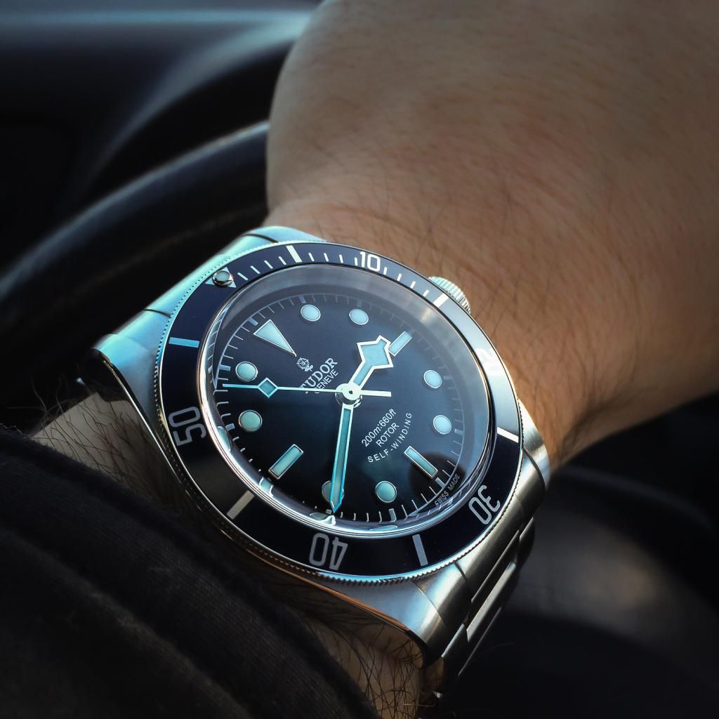 It's important to note that both have a silver internal side that reflects light onto the dial. Due to the gold hands of the RED, its easy to see why the dial can look very warm at times, and with the BLUE having white gold hands, it will look cold at times. This is due to the light bouncing of the sides and catches the colors of the hands and indices borders and affecting the color of the dial. When it comes to legibility, both are about as good as it gets, but Id give the slight edge to the RED as the lume color is very bright, even in daylight and shade and contrasts better than the whiter lume on the BLUE. At times, I felt the REDs lume could almost be a little overwhelming in daylight as it turns very yellow against the red bezel, and the colors can be a little overwhelming. I don't like either of these on straps due to the small gap between the case and strap end. If I was to choose though based on strap, the red's is much nicer, as distressed blue isn't to my liking. Lastly, I'd like to add that for collectors and those that can live with the RED, that is the one to buy. It's just more special in many ways. The BLUE is great in it's own right and its heritage is substantiated, but it just doesn't have the WOW factor the RED has. So in the end which did I choose? BLUE.....because as my daily watch I just couldn't live with the RED. Later on when I re-build my collection, I will add the RED, no doubt. I hope this helps those having a tough time choosing between these tow brilliant watches. 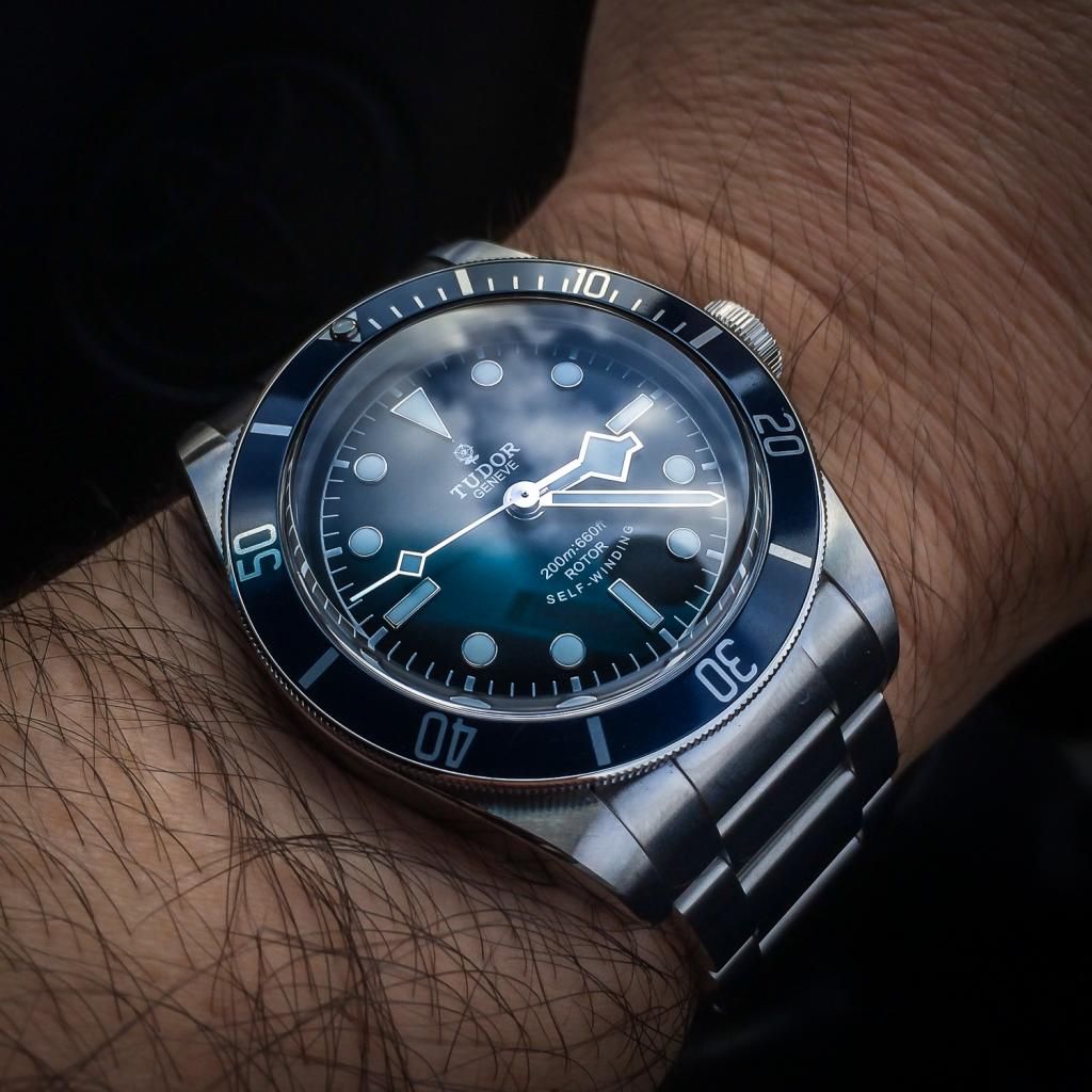 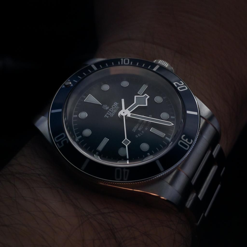
|
|
|

|
|
|
#2 |
|
TRF Moderator & 2024 DATE-JUST41 Patron
Join Date: Apr 2012
Real Name: Tim
Location: Pennsylvania
Watch: 14060M
Posts: 71,828
|
Fantastic comparative review, I too would have probably made the same choice as you did!

__________________
 Rolex Submariner 14060M Omega Seamaster 2254.50 DOXA Professional 1200T  Card carrying member of TRF's Global Association of Retro-Grouch-Curmudgeons Card carrying member of TRF's Global Association of Retro-Grouch-Curmudgeons   TRF's "After Dark" Bar & NightClub Patron TRF's "After Dark" Bar & NightClub Patron   P Club Member #17 P Club Member #17  2 FA ENABLED
|
|
|

|
|
|
#3 |
|
"TRF" Member
Join Date: Nov 2013
Real Name: Jonathan Ocab
Location: Riverside, CA
Watch: 116710BLNR
Posts: 279
|
I agree that the blue is a better everyday watch. That said, I've been pondering the red because I want a red accented watch for occasional wear.
Solid pics, BTW.
__________________
They took my rings, they took my Rolex. I looked at the brotha said, "Damn, what's next?" |
|
|

|
|
|
#4 |
|
"TRF" Member
Join Date: Feb 2014
Real Name: Stephanos
Location: Oxford, UK
Posts: 9
|
Excellent review coupled with even better pictures. You sir just made this great place an even better one.
Many thanks for your time, i sure enjoyed reading it!!! How about a Tudor Fastrider Black Shield review next? :) |
|
|

|
|
|
#5 |
|
"TRF" Member
Join Date: Apr 2009
Location: Melbourne
Watch: SEIKO SLA033
Posts: 665
|
Thanks guys glad you like it. I've never had such a tough time choosing between 2 colors of the same watch, and I've certainly never bought the one I felt was second best but I know myself and I just don't wear enough red to justify the original, and I don't want the watch to stand out too much. Either way I will own both at some point I'm sure. Or maybe once I have my Sub-C ill trade my blue for red
|
|
|

|
|
|
#6 |
|
Banned
Join Date: Oct 2005
Real Name: Gerardo
Location: Here
Watch: ALL of them
Posts: 32,098
|
Thank you for sharing! I am anxiously waiting to see a blue in the flesh
|
|
|

|
|
|
#7 |
|
TRF Moderator & 2024 DATE-JUST41 Patron
Join Date: Jul 2013
Real Name: Adam
Location: Hong Kong
Watch: SEIKO
Posts: 28,362
|
Great stuff, thanks, we could use more posts like this around here. The only thing I would say is that while very nice, the photos don't reflect the reality of the watches in quite the same way your writing does. Would be nice to see some good-quality, regular wrist shots here, too. I have tried on both, and neither looked as appealing as they do in these photos.
But again, thanks for your work 
|
|
|

|
|
|
#8 |
|
"TRF" Member
Join Date: Sep 2008
Location: singapore
Posts: 6,424
|
Agree - The blue is more understated and the red is more flashy. Blue is probably better as a daily wearer.
But the gold trim on the red is simply too beautiful for me to ignore, which is why I went with red. 
|
|
|

|
|
|
#9 |
|
"TRF" Member
Join Date: Aug 2012
Real Name: Michael
Location: SF Bay Area
Watch: Any Rolex!
Posts: 1,060
|
Excellent review and great quality pictures! Thank you for your contribution!
|
|
|

|
|
|
#10 | |
|
"TRF" Member
Join Date: Apr 2009
Location: Melbourne
Watch: SEIKO SLA033
Posts: 665
|
Quote:
The way these watches look depends greatly on the light you see them in. I don't shoot my watches in bad light so this only shows how they look in goo light at the right angles. But they are really this nice, outside of the ugly dealer's lighting |
|
|
|

|
|
|
#11 |
|
"TRF" Member
Join Date: Dec 2012
Real Name: M
Location: Boston
Posts: 1,024
|
Blue is much more elegant. Never understood why anybody cared about the red version.
|
|
|

|
|
|
#12 |
|
2024 ROLEX DATEJUST41 Pledge Member
Join Date: Nov 2007
Location: San Francisco, CA
Watch: Date & No Date
Posts: 10,856
|
Great write up, stunning photos!!!
__________________
"You might as well question why we breathe. If we stop breathing, we'll die. If we stop fighting our enemies, the world will die." Paul Henreid as Victor Laszlo in Casablanca |
|
|

|
|
|
#13 |
|
"TRF" Member
Join Date: Jun 2010
Real Name: James
Location: Toronto
Watch: IG: @j.project
Posts: 2,194
|
Those photos are phenomenal! Great comparison of the two black bays as well.
|
|
|

|
|
|
#14 |
|
"TRF" Member
Join Date: Jul 2010
Location: NOR-CAL
Watch: Grail Daytona
Posts: 1,306
|
 Great review and awesome photos....true quality.. Great review and awesome photos....true quality.. As a red owner I would agree with you completely. And the red does look better on a strap.
__________________
ROLEX:(116200)SS DATEJUST,(216570)SS EXPLORER II "POLAR",*(116518-0073)YG DAYTONA*,(116718)YG GMT MASTER IIc,(16610)SS SUBMARINER 50th LV,(16623)TT YACHT-MASTER ~BREITLING:SUPER OCEAN 44 ~JLC:NAVY SEALs ~OMEGA:PLANET OCEAN "LIQUIDMETAL LE" & (2201.51),SPEEEDMASTER PRO "METEORITE DIAL",SEAMASTER PRO GMT "GREAT WHITE" ~TUDOR:BLACK BAY(R) |
|
|

|
|
|
#15 |
|
"TRF" Member
Join Date: Jun 2014
Location: GMT -6
Watch: 114060
Posts: 212
|
I like the red one.
|
|
|

|
|
|
#16 |
|
"TRF" Member
Join Date: Dec 2013
Location: Singapore
Posts: 230
|
I like the red more. I feel it is the color of the BB, like how I feel about orange on the Omega PO.
Sent from my GT-I8160 using Tapatalk 2 |
|
|

|
|
|
#17 |
|
"TRF" Member
Join Date: Feb 2013
Real Name: Tom
Location: Kauai
Watch: 1675-1680-16750
Posts: 3,346
|
Incredible pictures!!! Love my Red! However one day I will own the Blue!
|
|
|

|
|
|
#18 |
|
"TRF" Member
Join Date: Aug 2013
Real Name: Wes
Location: Holosuite
Posts: 6,345
|
The blue version is much nicer, in my opinion. The only thing that's really odd about the BB (to me, at least) is the snowflake hour and second hands. It doesn't make much sense with the circular lume plots. The snowflake hands work great on the Pelagos since the lume plots match. I would much rather see the lollipop hands on the BB.
|
|
|

|
|
|
#19 |
|
"TRF" Member
Join Date: Apr 2014
Location: California
Posts: 180
|
Me too. I liked the red BB from photos, but bought it on the spot when I saw it in the metal and put it on my wrist. I've never seen anything like it in terms of warmth and tonality. The deep red, rose gold, gilt lettering, and dark chocolate dial are unbelievably warm and inviting. I doubt I will ever give up my BB!
|
|
|

|
|
|
#20 |
|
"TRF" Member
Join Date: Oct 2013
Location: Singapore/London
Posts: 545
|
Mine says hi
|
|
|

|
|
|
#21 |
|
2024 Pledge Member
Join Date: May 2012
Location: Planet Earth
Watch: Varies
Posts: 2,031
|
Love the blue, you chose well.
|
|
|

|
|
|
#22 |
|
"TRF" Member
Join Date: Apr 2012
Location: UK
Posts: 2,205
|
Great review by the Op and incredible photo's. I love my red and would be reluctant to ever let it go. The differences between the red and blue are enough to justify having both...................that's what I'm telling myself anyway!

|
|
|

|
|
|
#23 |
|
2024 Pledge Member
Join Date: Aug 2009
Real Name: Travis
Location: FL / NYC
Watch: Yes..
Posts: 32,218
|
Great review and pics!
|
|
|

|
|
|
#24 |
|
"TRF" Member
Join Date: Jul 2012
Real Name: Jack
Location: Wisconsin
Watch: me vector
Posts: 1,152
|
Great review and pics. Thanks for posting this.
Honestly, I'm still torn between the 2. I like them both and I think I would be quite happy with either. |
|
|

|
|
|
#25 |
|
Banned
Join Date: May 2012
Location: USA
Watch: SubC, Daytona
Posts: 588
|
Great work there comparing the 2. Choosing between the 2 really depends on factors such as one's existing collection, lifestyle and perhaps wardrobe or maybe just down to each individual's personal taste.
Personally I thought the red BB would be great for casual days and weekends. There is a certain X factor to it which hit me as soon as I laid my hands on one at an AD. The more I saw it the more I wanted one. In the end I went with the bracelet for versatility and durability and also had a brown/tan vintage strap customized to my liking. I must say I love it on both but with an edge to the leather. To me it just works so well. Hope you don't mind if I share a few pics to illustrate |
|
|

|
|
|
#26 |
|
"TRF" Member
Join Date: Mar 2009
Location: USA
Watch: GMT-Master II
Posts: 3,417
|
Nice review.
Thanks for sharing your thoughts. |
|
|

|
|
|
#27 |
|
2024 Pledge Member
Join Date: Jan 2009
Real Name: Chuck
Location: SW Florida
Watch: 16233,16610,214270
Posts: 11,183
|
IMO the blue is the winner. I would jump all over it if it wasn't for the snowflake hands. I just never liked them. I know Mercedes hands would make it look like a sub but sword hands would have been perfect.
__________________
16233 Y Serial Datejust 16610 Z Serial Submariner 214270 Explorer 114300 Oyster Perpetual 76200 Tudor Date+Day |
|
|

|
|
|
#28 |
|
"TRF" Member
Join Date: Apr 2009
Location: Melbourne
Watch: SEIKO SLA033
Posts: 665
|
Can't agree on the sword hands, but yes Mercedes hands would have been ideal, but that just wouldn't happen as Rolex have clearly taken that distinction away from Tudor many years ago.
I think overall its a nightly success. I'd like to see new versions with ceramic bezels and two sided hands to make them perfect. For the time being we'll just have to do with what we have.... 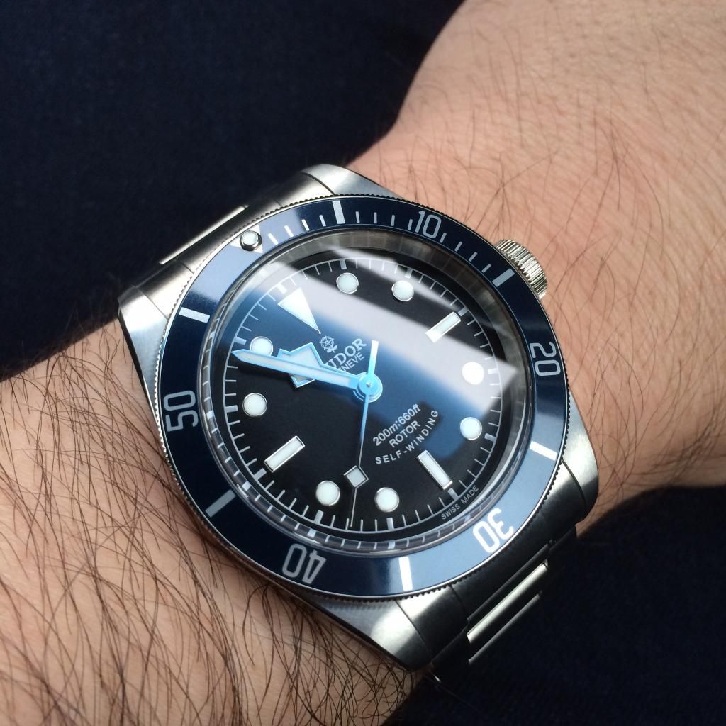
|
|
|

|
|
|
#29 |
|
"TRF" Member
Join Date: Sep 2013
Location: Winnipeg, Canada
Watch: Speedmaster Pro
Posts: 55
|
After waiting for my AD to get the Blue Bay in and making my decision, I went with the red, making the choice in about 60 seconds.
The blue would go better with any outfit etc, but it also just feels, less... special. There's just something about the original BB color scheme that you'll never see elsewhere. It just works, and has so much warm depth. |
|
|

|
|
|
#30 |
|
2024 ROLEX DATE-JUST41 Pledge Member
Join Date: Sep 2010
Real Name: Randy
Location: USA
Watch: Rolex
Posts: 1,917
|
Quote:
|
|
|

|
 |
| Currently Active Users Viewing This Thread: 1 (0 members and 1 guests) | |
|
|
*Banners
Of The Month*
This space is provided to horological resources.