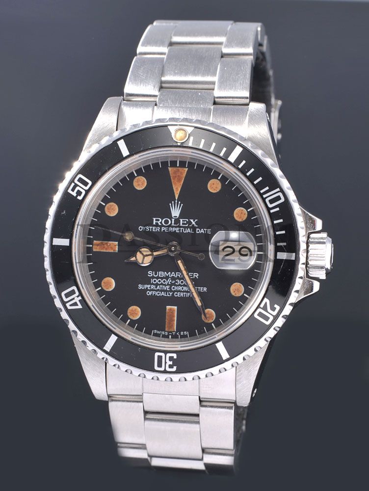
I have a few issues with this dial myself, but also the watch itself.
Let's compare two 16800s of the similar vintage
High def image of our suspect dial & watch

High def image of a vintage 16800

* The 12 lume is literally almost touching the coronet, and while I've seen lumes similar, I haven't seen one that is that close AND ever so slightly off center to the right of the tip of the coronet. The 12 lume should carry a center line exactly down through the center tip of the coronet
* Compare the 12 lume in pic #1 vs the 12 lume in pic #2. In pic #2, each tip of the 12 lume is razor sharp.
* Look at the second O in CHRONOMETER. The tips of the top & bottom quadrant of the O extend above and below the N and the M next to it.

* The Sans Serif date wheel is off. Maybe it's a service calendar wheel, who knows, but it definitely isn't matched to a vintage 16800.
* The crown guards are problematic. This is always a red flag. A real sub has no gap between the crown & the guards. See how the 16800 in pic #2, the crown guards flare out, extend further and "hug" the crown? This is not the case in pic #1. There is a noticeable gap.

* The break angle of the inside of the bottom crown guard looks different and more shallow from the break angle of the inside of the top crown guard.
* Notice how the bottom crown guard is shorter in horizontal length (extending outward) than the top guard is in pic #1, while in pic #2, it is perfectly centered on the crown.
* The oxidation on the hands doesn't match. The second hand has a noticeably more pronounced patina than the hour & second hand. Notice in pic #2, the hands all have even patina, meaning that those are the original set of hands that have aged uniformly over time. In pic #1, the minute & hour hands are much cleaner than the second hand. The second hand is dramatically worse. While patinas are not always uniform, obviously, this is quite a discrepancy.
* The magnification of the cyclops seems a hair off. Look at pic #2, how the 29 jumps right out. Granted its on an angle and the calendar font is correct, but still, you see how the magnification pops the 29 out at you. Pic #1 is close, but again, notice how we keep coming back to "close."
* Look at the detail on the hour hand in pic #1, and compare it to the crispness of the hour hand in pic #2. In pic #2, the hour hand is even, thin & crisp.
While I cannot and will not say 100% for certain that this is a fake, what I can say is that the crown guards are very bothersome. It could be authentic, but there's enough wrong with this one for me to immediately pass on it.