Hey guys,
As the title says, this thread is about the Rolex Daytona 116520 dials and their variations over the years. This thread comes as a follow-up to my previous one which covered only the black dials.
As I said before, I've spent some time in trying to figure out what are the diffrences between the dials of the stainless steel bezel 116520 rolex daytona and while doing so, i've managed to also find some other key diffrences between time periods regarding other aspects of the watch .
I'll also include these findings at the end of the dial study below.
Although i think i've managed to include most of the dials out there, this is just a personal study, made by analysing pictures found on the internet and may not be complete or tell the whole story. So please feel free to share your opinion and/or add any missing dials or details left behind.
This study was done not only to observe differences between dials but to also group the daytona into time categories, making period identification of a watch much easier.
I don't know how things are where you live, but here a lot of watches are missing papers so I really hope this guide will come in handy when trying to determine a rolex daytona manufacturing year .
Ok, lets begin!
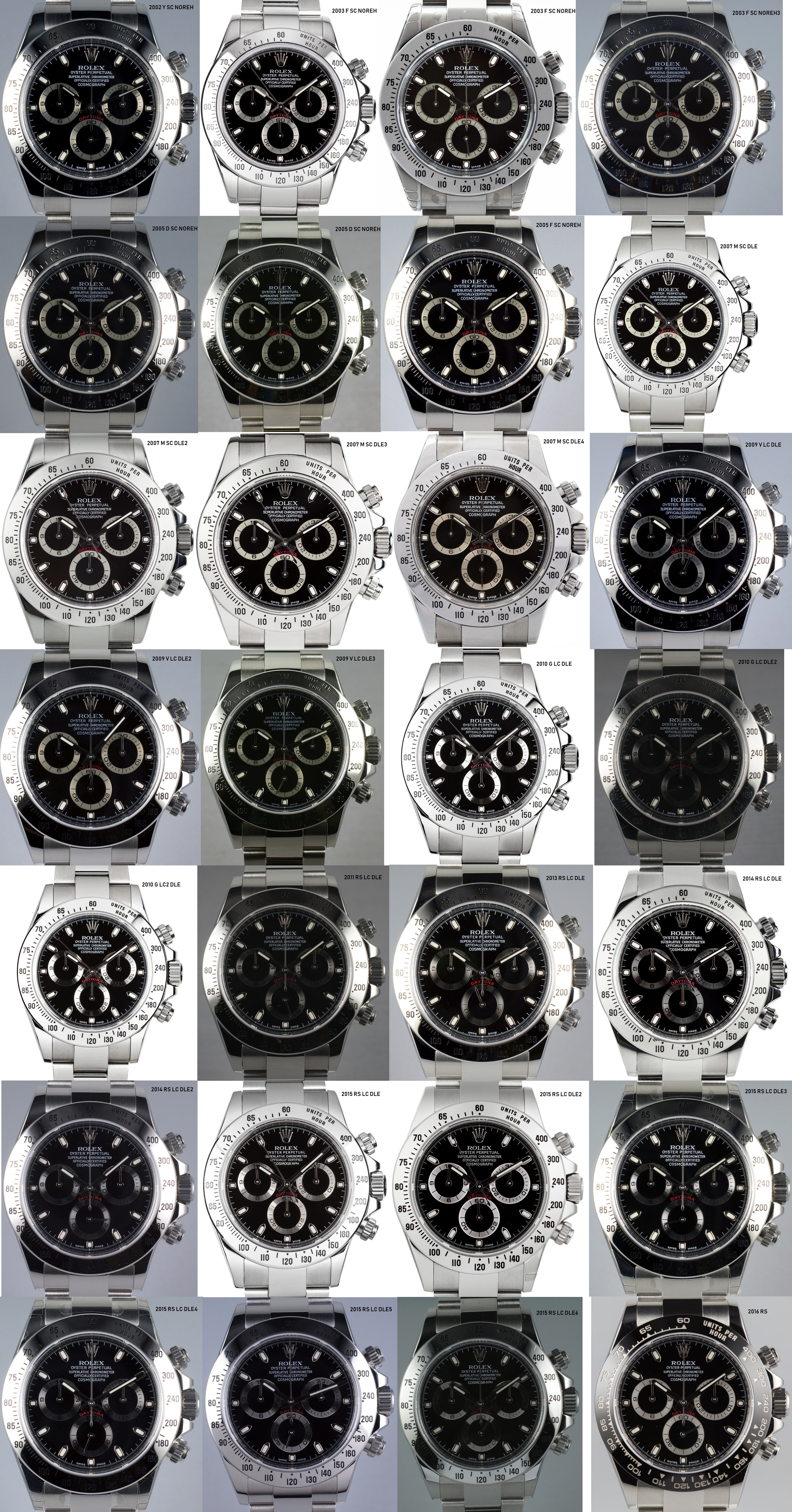
I'll first start with the black dials :
NOTE: All the pics are hi-res so please zoom in to see the full details.
Tag meaning :
RS - Random serial
SC - short clasp / old style clasp:
LC - long clasp / current style:
DLE - double line engraving:
NOREH - no rehaut engraving:
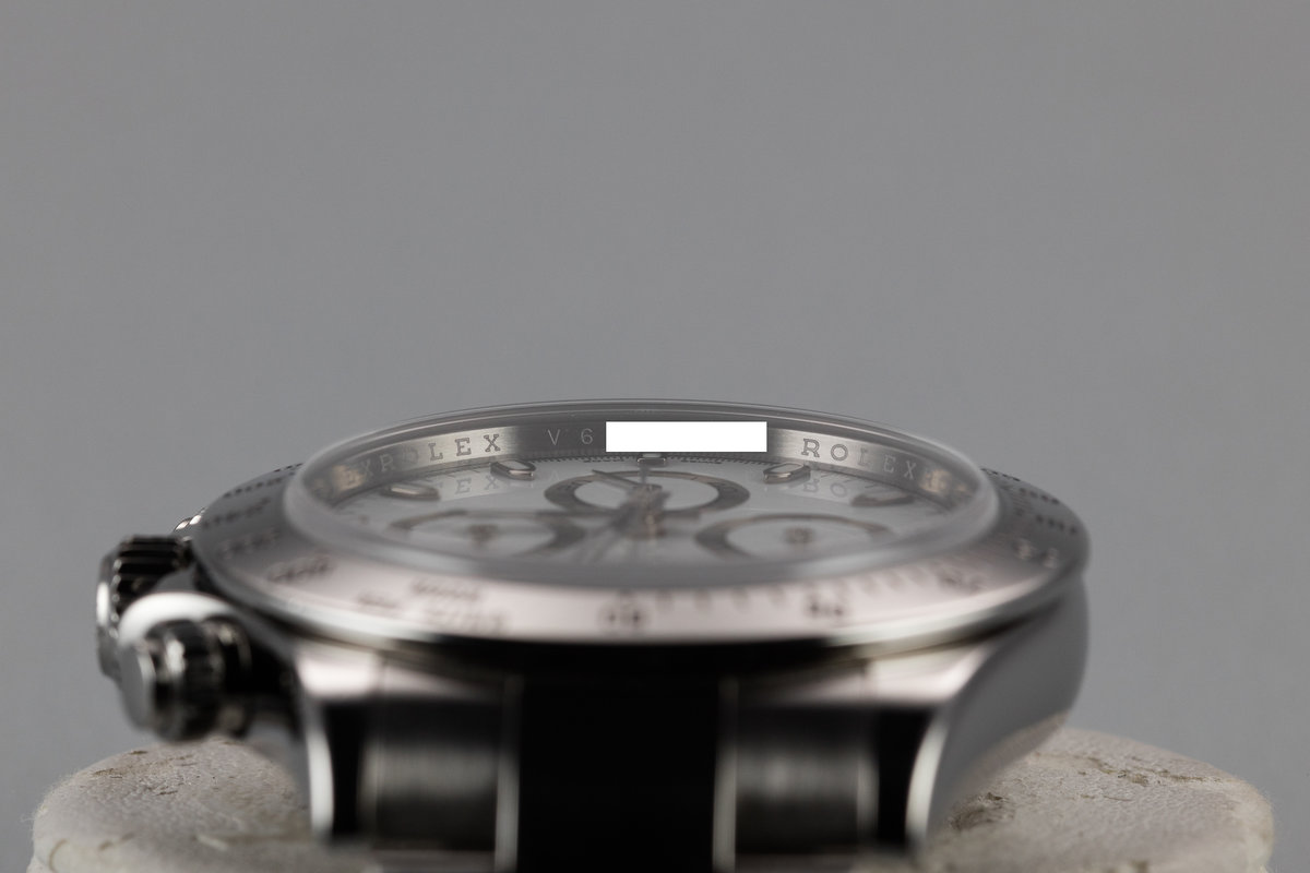
Laser etched rehaut :
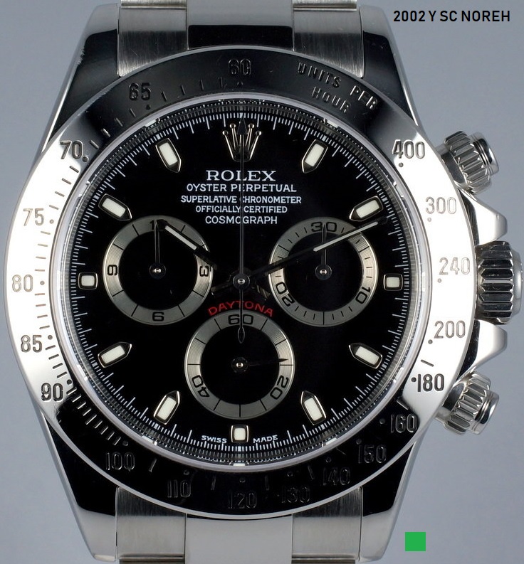
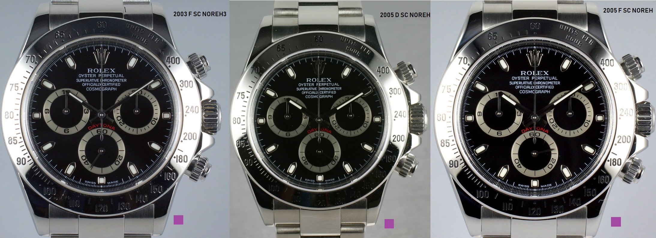
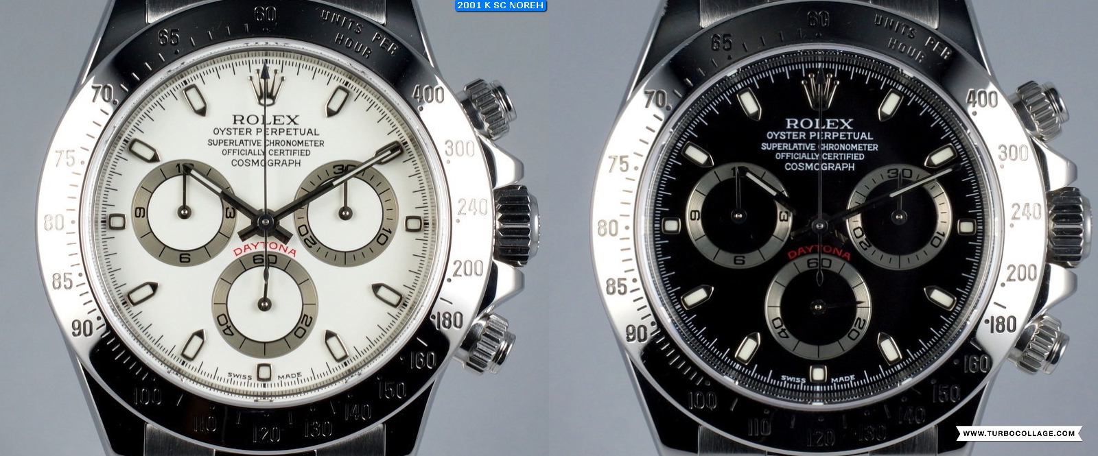
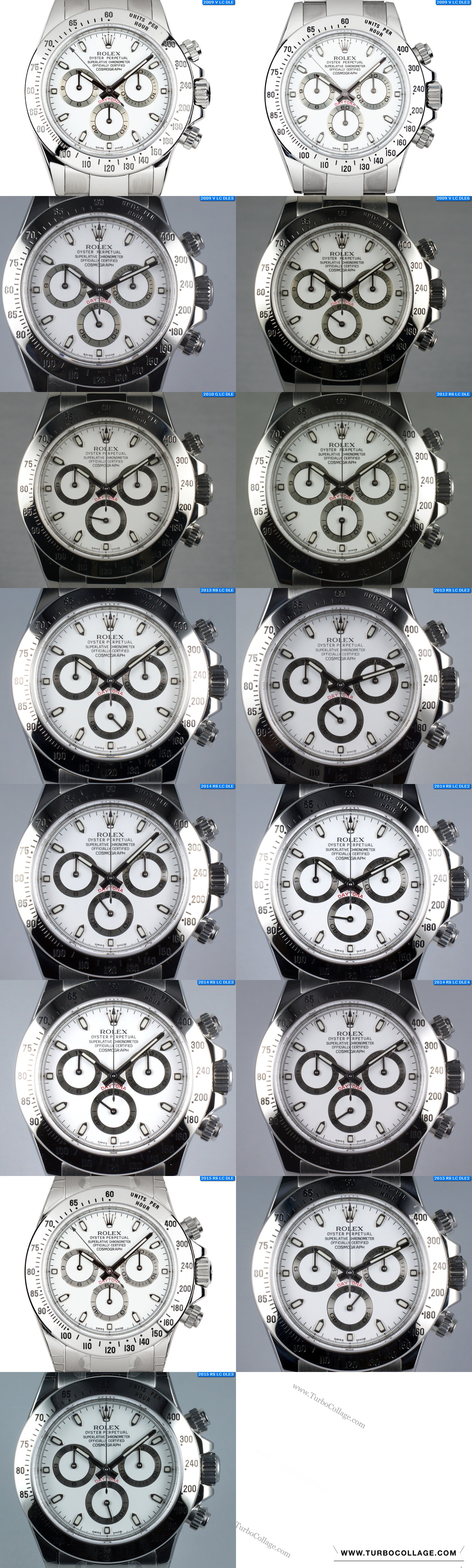
 1. Flat 4 serif dials, most likely 2002 :
- The middle line of the E in ROLEX looks short and pretty much centered.
- the 4 in the 40 of the 6 o'clock seconds subdial is flat / upper part of the 4 is flat and wide
- 'O' in 'oyster' looks to be somewhere between 0(zero) and O
- 'swiss made' is serif
- The minute ticks under SWISS MADE almost touch the font. The 31 min tick hits the S bottom left while the 29th min tick sits in the center of the letter M
- 27 and 33 minute markers are long
 2. Flat 4 dials, ~2003-2005 :
This 2nd category is part of a larger one which i'll call " the tall O" category. If you look carefully you'll see that the O lettrs of the word chronometer are taller than the rest and look more like zeros.
- the 4 in the 40 of the seconds subdial is still flat / upper part of the 4 is flat and wide
- 'O' in 'oyster' looks to be somewhere between 0 (zero) and O
- 'swiss made' is not serif any more
- The minute ticks under SWISS MADE are a bit shorter than before. The 31 min tick sits a bit more to the right of the last S while the 29th min tick sits in the center of the letter M like before
- 27 and 33 minute markers are long
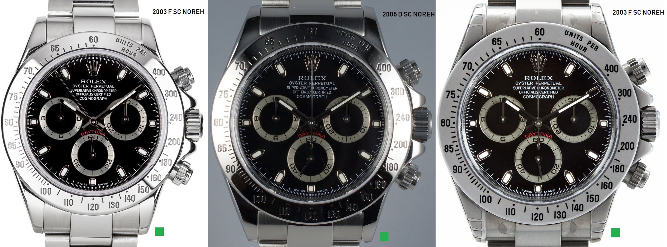 3. I'll call this one the` Higher E` or `Upper E` , 2003-2005 :
This one is also part of the tall O category. ROLEX font looks similar to the previous group but there is one key difference:
- 4 in the 40 of the sec subdial is not as flat as before / top part is narrower than on the flat 4 dials
Remaining aspects of this group:
- The middle line of the E in ROLEX sits just above the midpoint of the letter like on the previous group but the previous gruop had a flat 4 ! keep this in mind.
- 27 and 33 minute markers are long
- The minute ticks under SWISS MADE look the same as on the flat 4 dials. The 31 min tick sits a bit more to the right of the last S while the 29th min tick sits in the center of the letter M.
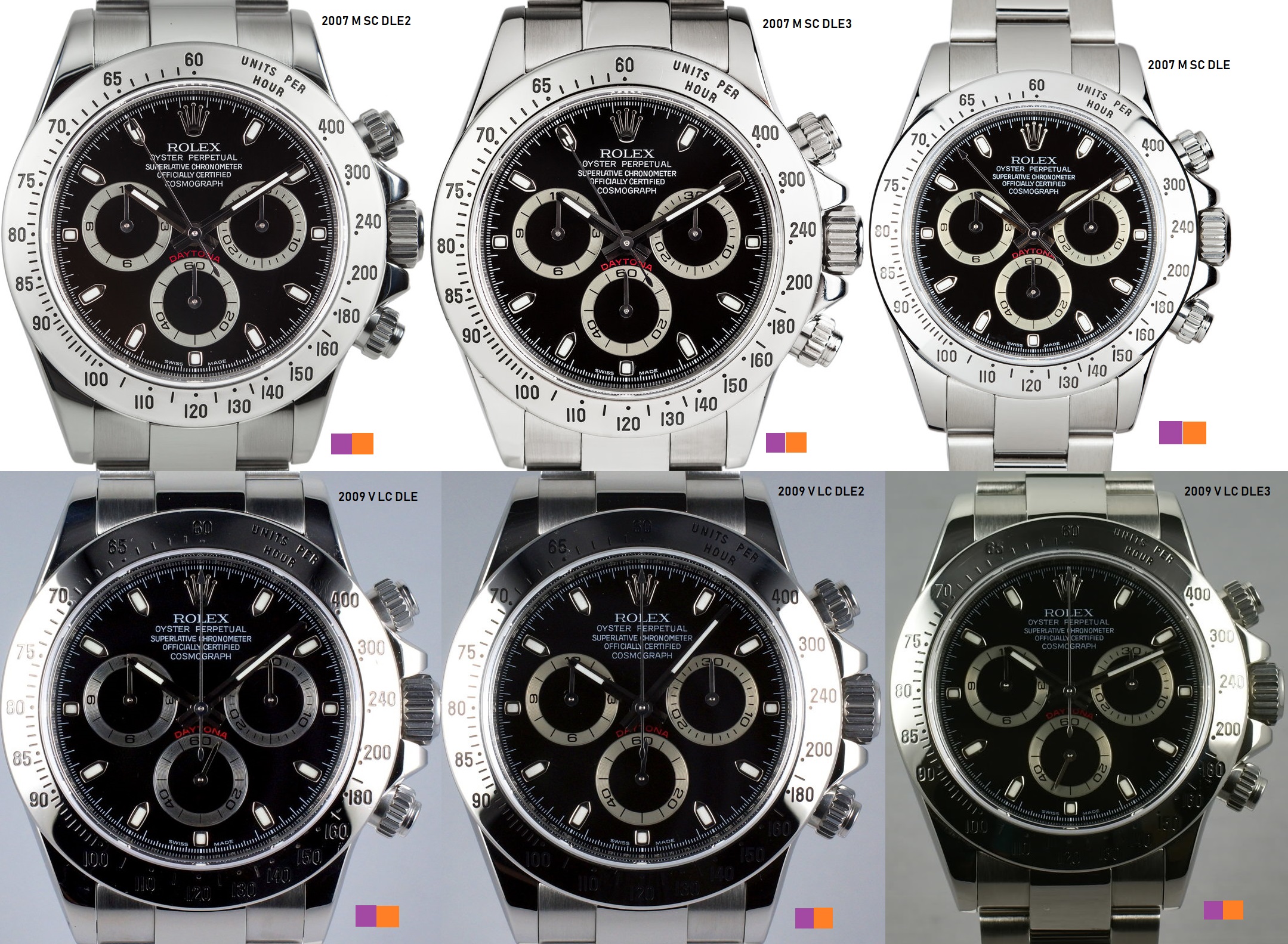
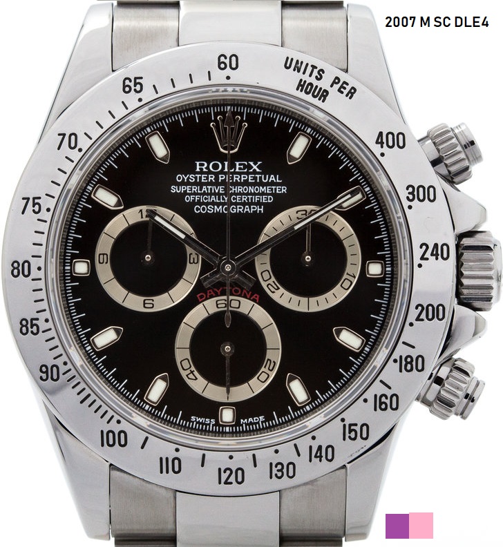
 4. Lower E 2007-2009 :
This one is also part of the tall O category but here is what makes this unique :
- The middle line of the E is just below the letter's midpoint
- 27 and 33 minute markers are short now
-31 min tick sits almost where the last S of the swiss ends. The 29th min tick sists almost under the M starts.
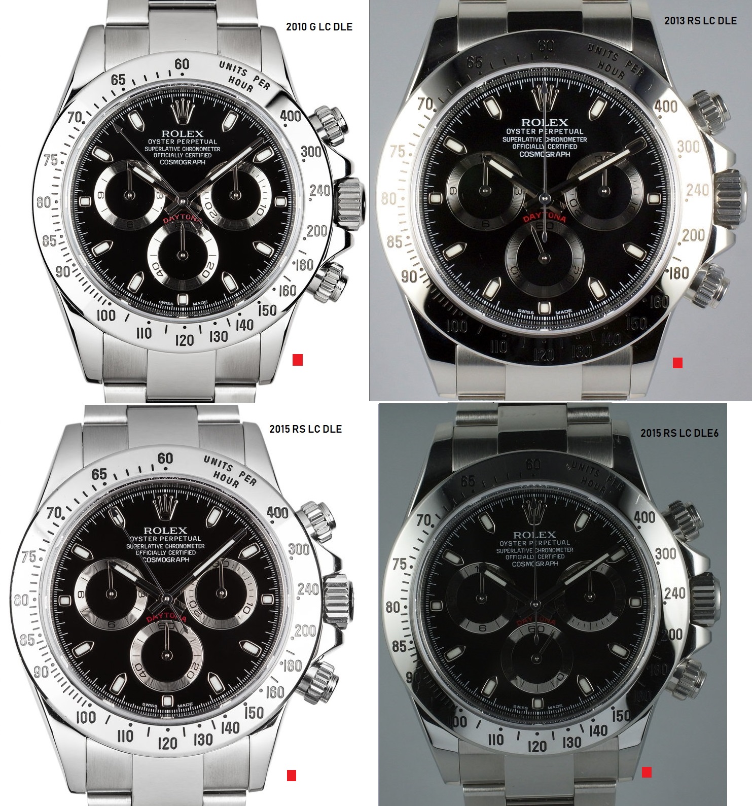
 6. FAT 'O' dials ~2010-2015:
This is a new category of prints found only on the black dials. I'll call this the 'FAT O' dials because of the fat O of the oyster word :)
- 'O' is "OYSTER' looks fat / rounded
- Middle line of the E sists above the midpoint of the letter but this aspect is not as helpfull as before in differentiating dials.
- 27 and 33 min markers are long
- Rolex coronet has a bigger hole / more rouned as well
- another key feature is that all the dial print in white is serif!
- 31 min tick sits almost below the center of the last S in Swiss. 29th min tick sits almost where the M begins. This feature is again not that important.
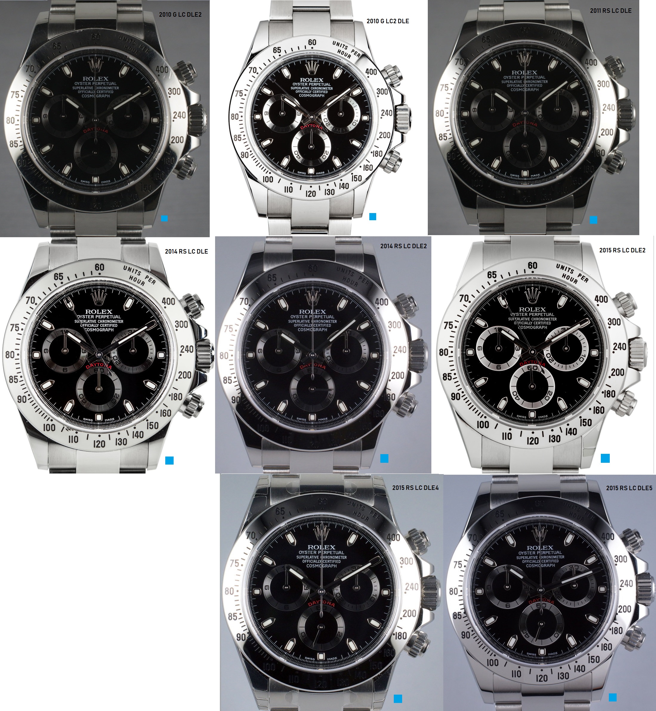 7. FAT 'O' short ticks ~2015 :
This is almost the same as the 'FAT O' dial but with some differences :
- same as the regular fat 'O' dials but the 27 and 33 min markers are short this time
- text doesn't look serif this time
- same coronet as before
- 31 min tick sits almost below the center onf the last S in Swiss. 29th min tick sits almost where the M begins. Same asa before.
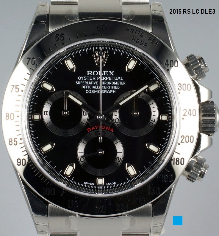 8.APH dials ~2010-2015 :
This is a whole new category. The main characteristic is that the APH letters of the COSMOGRAPH sit a bit separated from the rest of the letters. Here are a few details:
- APH letters of the 'cosmograph' word are a bit separated from the rest of the word
- 'O' in 'Oyster' looks more like a zero this time
- More tracking on the OYSTER PERPETUAL / spaces between letters are bigger
- 27 and 33 minute markers are short
- I wont bother to list the remaining characteristics as these are not as relevant imo.
 Notice:
 There was another category in my previous attempt to classify the black dials, called the funny E. However, after a closer inspection, Ive realised that the watch in discussion was most probably serviced with some pre-owned parts. The case itself was indeed a 2007 M but the dial was a flat4serif, hands were slim, like on the 2002 models and the insert was actually from an older generation 16520 daytona . So in conclusion, the funny E does no longer exist.
Here is the watch I was referring to :
Ok ,so with the black dials pretty much covered, lets move on and study the white dials :
 Tag meaning is the same as for the black dials:
RS - Random serial
SC - short clasp / old style clasp
LC - long clasp / current style
DLE - double line engraving
NOREH - no rehaut engraving
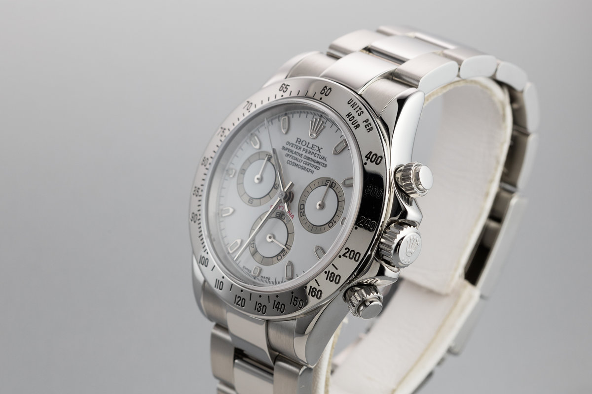
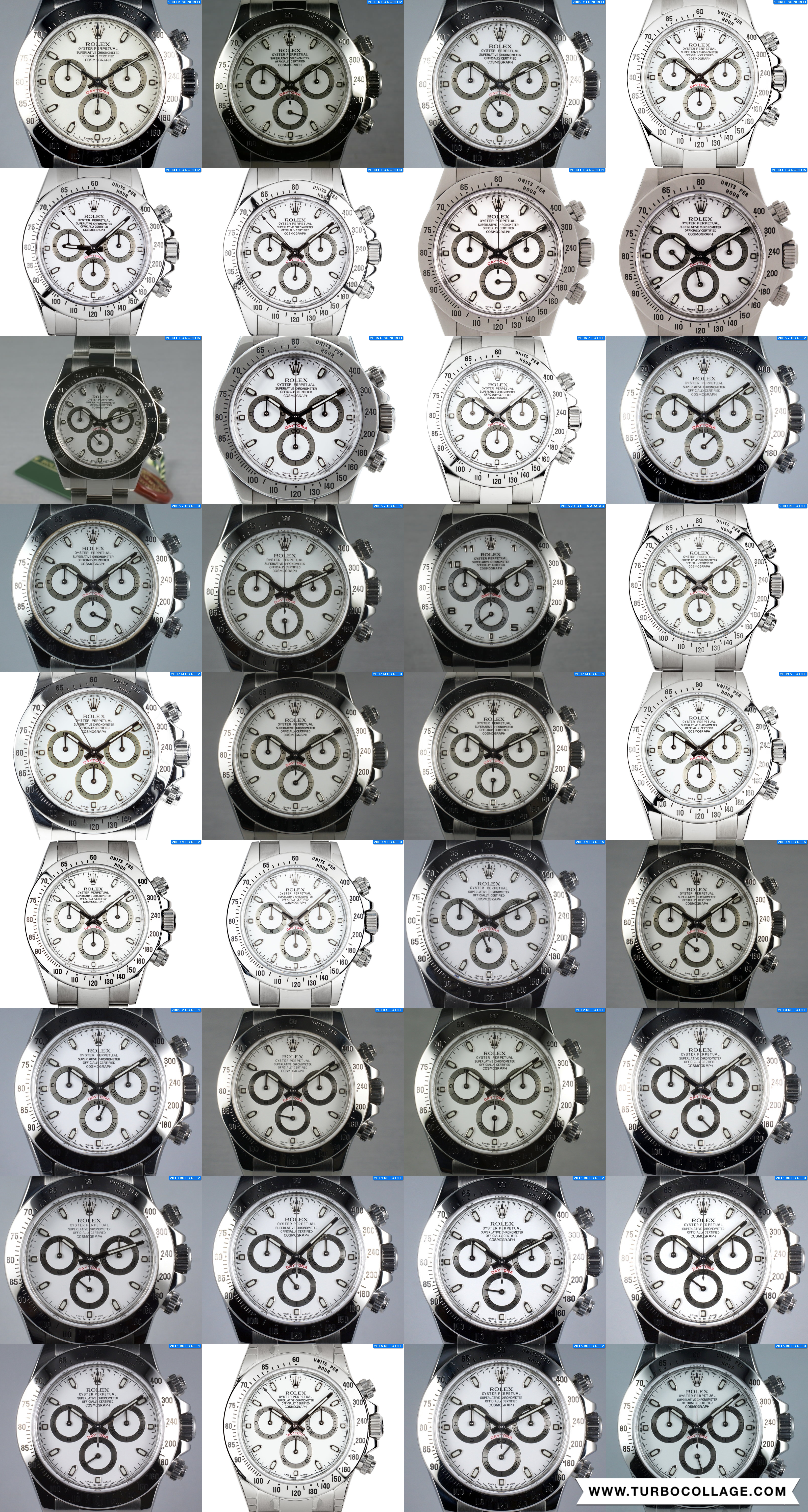
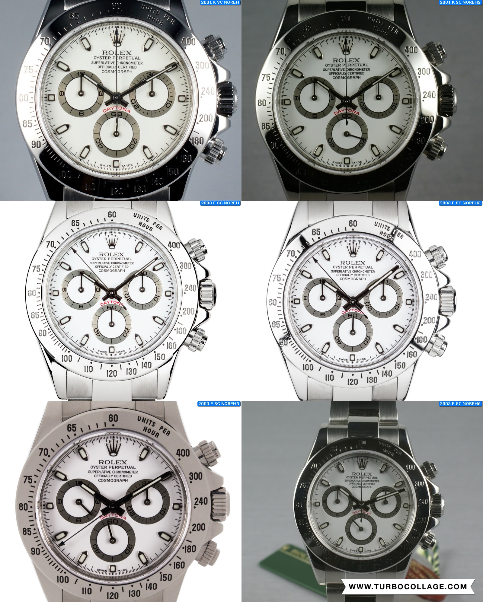
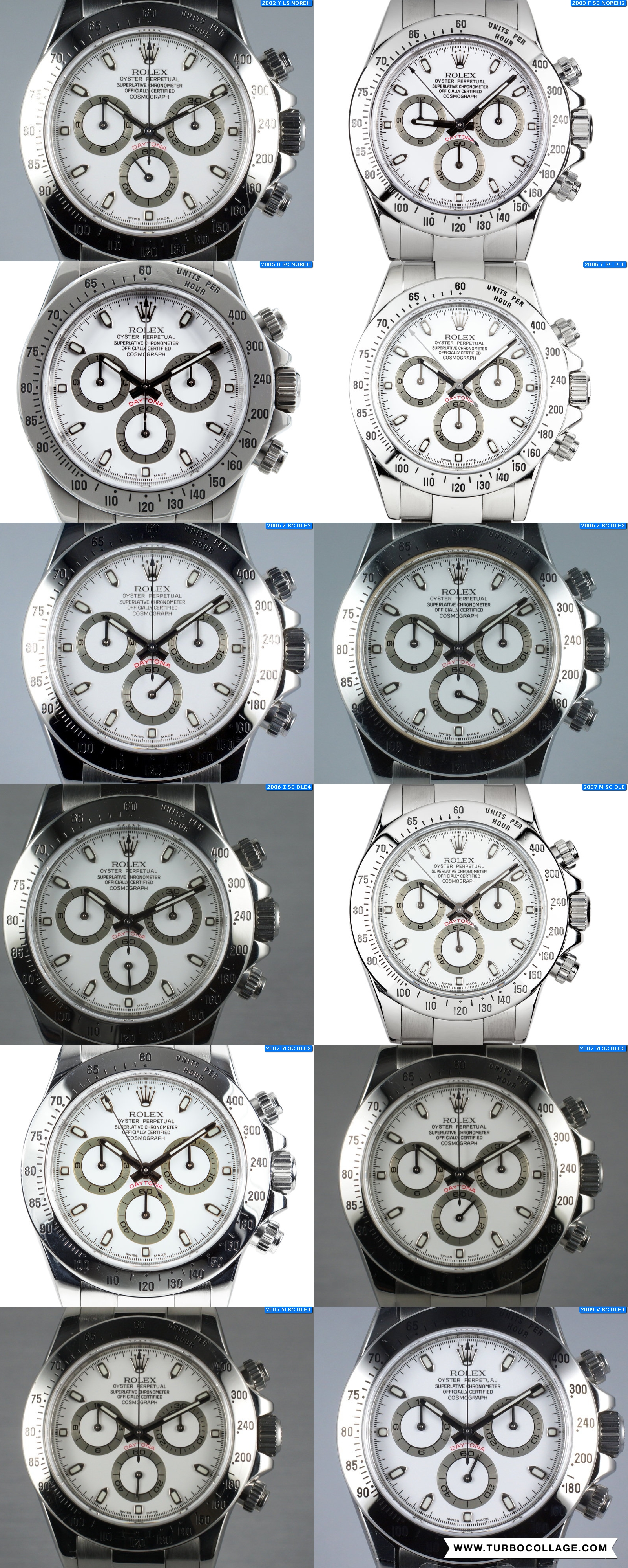
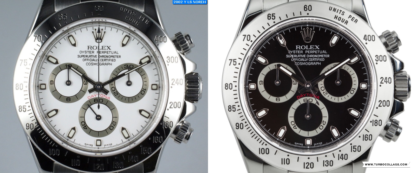
1.Flat 4 serif dials ~2001-2003 :
Although Im not 100% sure ,It seems that the 1st 116520 daytona to come out was the white dial version.
This dial is pretty much similar to the black counterpart, having a similar print layout:
- The middle line of the E in ROLEX looks short and centered.
- the 4 in the 40 of the 6 o'clock seconds subdial is flat / upper part of the 4 is flat and wide
- 'O' in 'oyster' looks to be somewhere between 0 and O
- 'swiss made' is serif
- The minute ticks under SWISS MADE almost touch the font. The 31 min tick hits the S bottom left while the 29th min tick sits in the center of the letter M
- 27 and 33 minute markers are long
And here is a comparison picture between the white and the black flat 4 dial :
 2.Lower E dials ~2002-2009 :
These dials fall into the Tall O category same as the flat4, higher E and lower E black dials.
Ill keep the name Lower E just because this dial is the same as the black lower E one but this name is not as relevant as before because there are no variations of the Tall O category for the white dials like there was with the black dials before.
So a more suitable name for this dial should have been Tall O .
As I said before, if you take a closer look youll see that the Chronograph word has the lettrs O taller than the rest and looking more like a zero .
Key features are similar to the black one :
- The middle line of the E is just below the letter's midpoint
- 27 and 33 minute markers are short.
-31 min tick sits almost where the last S of the swiss ends. The 29th min tick sists almost under the M starts.
Lower E comparison picture :
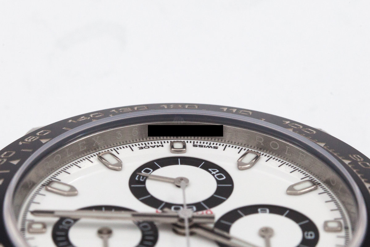
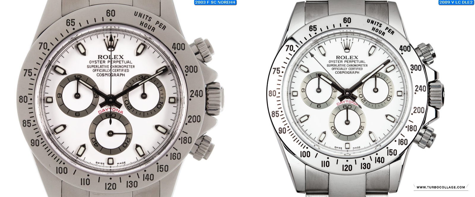
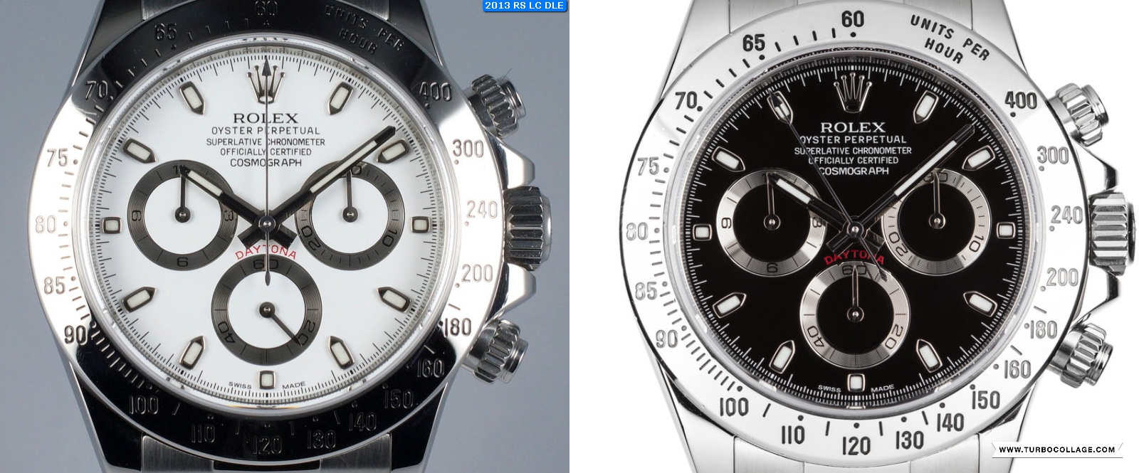
 3.Serif Cosmograph dials 2003-2009 :
This print is not present on the black dials! Oddly enaugh Ive found it on both a 2003 and a 2009 watch, so this dial makes identifying a watchs manufacturing year a bit harder.
The main feature distinguishing this dial apart from the rest is the serif COSMOGRAPH . The fat O black dial featured a serifi COSMOGRAPH as well but, so was the rest of the text. This white dial on the other hand has a very pronuanced serif look ( the cosmograph word ) while the rest of the text looks more normal if you will .
Some other characteristics of this dial :
- ROLEX seems to be a bit bolder than on the other white dials
- 27 and 33 min ticks are short
- 31 min tick sits below the end of the S in SWISS while the 29th min tick sits below just before the M in MADE starts.
- I wont bother pointing other aspects as the ones above are pretty much sufficient to define this category
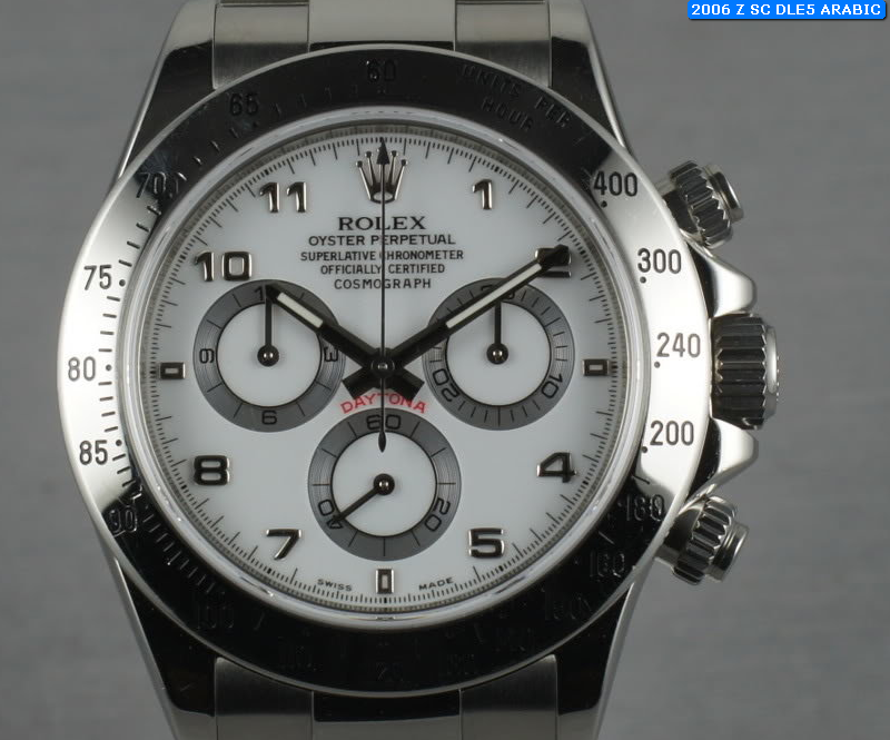
 4.Arabic dial ~2006 :
As far as I know there wasnt any stainless steel black daytona out there to feature an arabic dial, so this is a category on its own. Please keep in mind that there are some other arabic dials out there but found on the WG and platinum versions.
Although its obvious how one is able to differentiate this dial apart from all the other white dials Ill point out some details of the print and layout:
- At a first glance the print looks similar to the Fat O print found on the black dial .
- SWISS and MADE however sits further apart from the 6 oclock marker and the text looks wider as well.
- COSMOGRAPH is serif
Here is a pic comparing this to the Fat O black dial :
 5.APH dials ~2009-2015 :
The white APH dial is pretty much the same as the black APH dial, so same characteristics apply:
- APH letters of the 'cosmograph' word are a bit separated from the rest of the word
- 'O' in 'Oyster' looks like a zero this time
- More tracking on the OYSTER PERPETUAL / space between letters is bigger
- 27 and 33 minute markers are short
- I wont bother to list the remaining characteristics as these are not relevant imo.
Comparison pic between the vlack and white APH dial :
This pretty much sums it up . I hope you guys enjoyed this and I really hope this will make identifing a watchs manufacturing year a bit more easier.
As you can see the white daytonas are a bit harder to date, because of the less dial variations out there. So here are some more diffrences between key aspects of the watch i've managed to find across time periods.
Hopefully these new features will help you narrow your results :
1. 2002-2004
- short clasp / old style
- no rehaut engraving
- slim hands
- green lume
- flat 4 dial - most likely
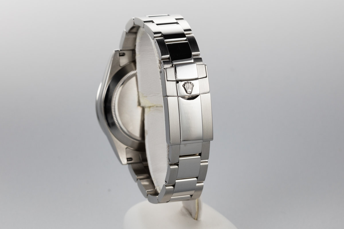
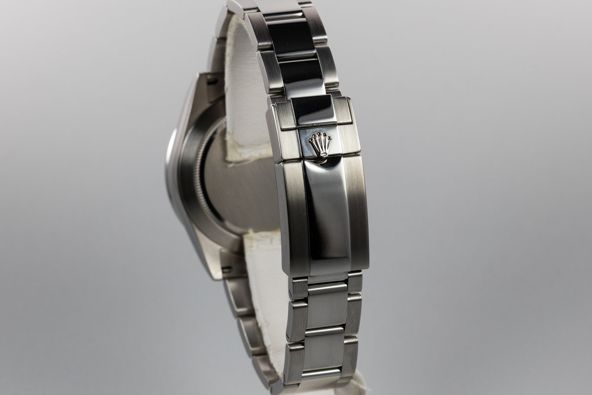
- SEL (solid end link) is made out of 3 pieces clamped together
3 pieces SEL :
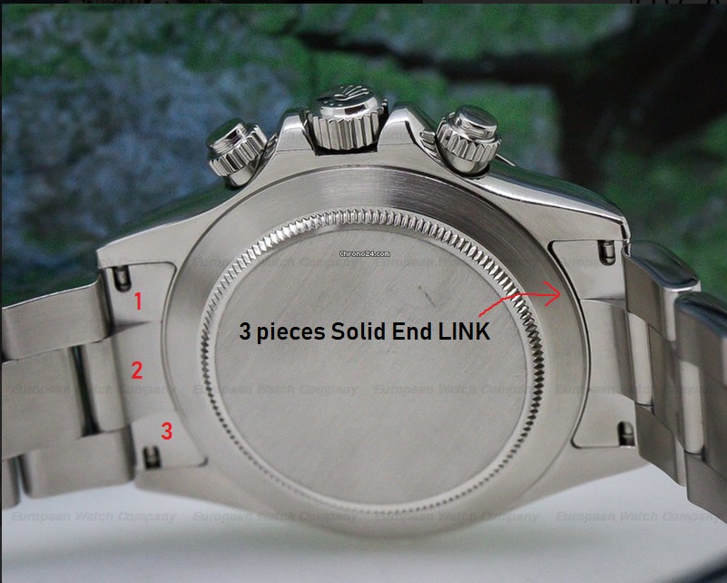
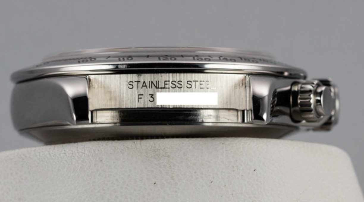
Please note that the cases which are not engraved on the rehaut, the serial will be engraved between the lugs as so :
 2. 2005
- no rehaut engraving
- fat hands
- 2005 correct dial
- short clasp
- SEL (solid end link) is made out of 3 pieces clamped together
- green lume
3. 2006-2008
- rehaut is engraved - not random! Serial may also be found between the lugs on the early 2006 models.
- fat hands
- short clasp ( some 2008 have the new styled clasp though and if so it's loding part has a sanded look )
- SEL (solid end link) is made out of 3 pieces clamped together
- green lume
4. 2009-2010
- rehaut is engraved - not random!
- fat hands
- new style clasp - sanded ( some 2009 still have the old syle clasp )
- SEL is made out of 3 pieces clamped together
- green lume
5. 2011-2013 ( lume transitional period )
- you cand find both 2011 and 2012 with green lume . Even some early daytons sold in 2013 were green but most likely these were made back in 2012.
- rehaut is engraved - random serial
- new style clasp - sanded
- SEL can be made out of 3 pieces clamped together on some 2011 models / SEL will be milled out of 1 single piece for the later modes.
Single piece Solid end link :
 6. 2014-2015
- rehaut engraved - random serial
- fat hands
- new style clasp - sanded
- SEL is milled out of 1 single piece.
- blue lume
7. 2016
- reahut may be laser etched - not sure
- fat hands
- new style clasp - polished ( the folding part is polished, not sanded like before)
- blue lume
While doing this research Ive also noticed some differences between bezels but I dont have enaugh info yet to properly classify them by period. Ill also add this study here as soon as Im done with it.
Another interesting thing Ive found ( which Im not entirely sure of yet ) while studying the new ceramic daytonas (116500) is that some watches on sale may actually be SS 116520 that have the bezel and dial swapped with aftermarket parts. Ill share more info on this as soon as Ill be 100% sure.
Please fell free to chime in and leave a comment if you like this or if you have anything to add !
Cheers!