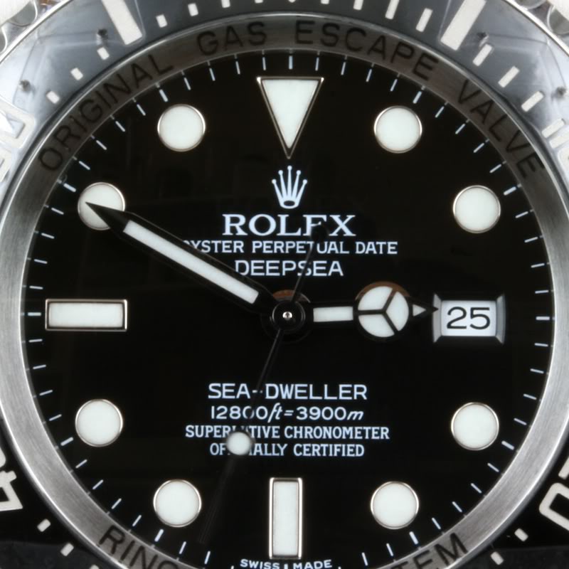
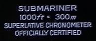
I believe it's known by now that the deepsea sea-dweller has received 2 changes to its dial since 2008:
Here is the "Mark I" dial:
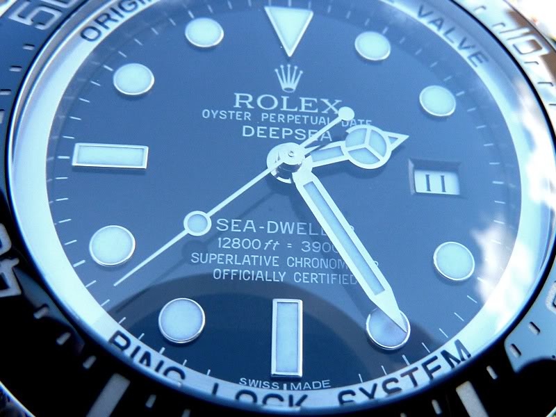
 And here's the Mark II dial:
As you can see, there are various differences to the predecessor dial:
Overall font is slightly "thinner".
- The painted rolex coronet has changed style to look more like the coronet on other rolex dials.
- The "e"s in "deepsea" now have a shorter middle line in the "e".
- The "s" in "sea-dweller" has been changed from a "flat" s to a "round" one.
- The "ft" font has been changed.
- The "=" sign is not on italic anymore but runs as two parallel lines.
- There is now a larger gap between the ft and metres depth rating, aka "gap dial" (seen on the newest sub 14060m's too, btw.)
Here is an overview of the details (with the 14060m - new and old models - included):

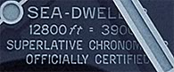
(all pics from r-l-x.de).
But there is also a third version that surfaced not too long ago:
The Mark III dial:
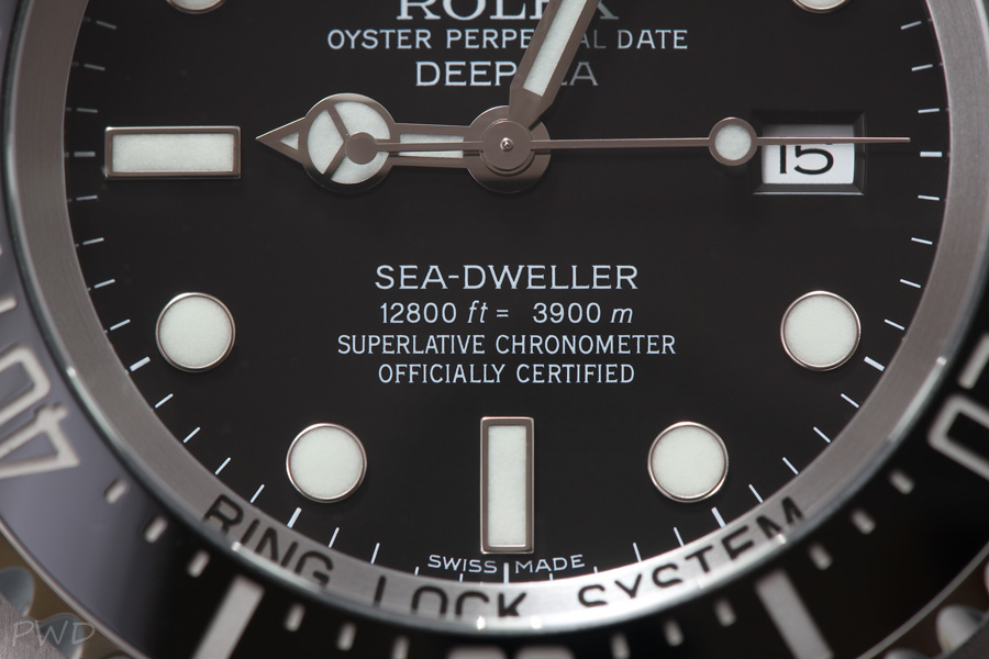
(credit: "purewhitedesign"; watchlounge.com)
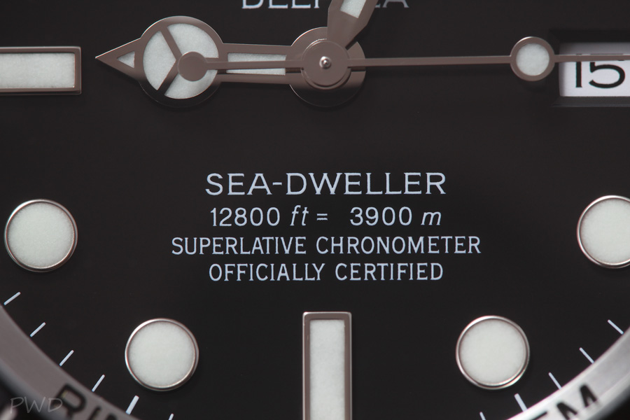
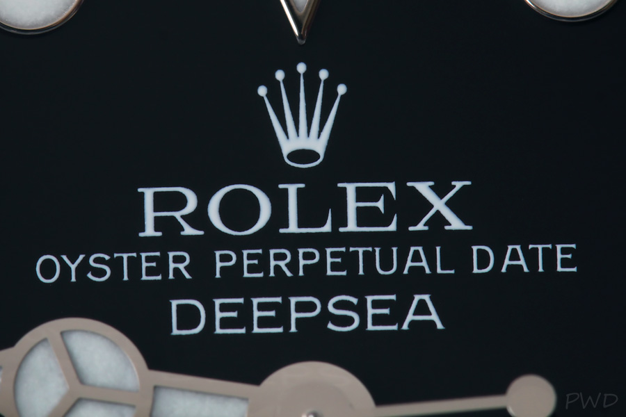
The rolex coronet on the dial of the MK III dial is identical to the one seen on the MK II dial:
(credit: "purewhitedesign"; watchlounge.com)
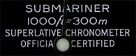
Also notice the uneven space between the equal sign "=" like it has also been seen on the sub 14060m dial bottom right... Plus the "MK III" deepsea dial has more space before and after the "ft" and "m":
