
|
|
ROLEXROLEXROLEXROLEXROLEXROLEX
 ROLEXROLEXROLEXROLEXROLEXROLEX
 11 September 2010, 12:00 AM
|
#1 |
|
"TRF" Member

Join Date: Mar 2007
Real Name: Mik
Location: USA
Posts: 13,723
|
I learned something on another site, I thought I'd share
The dial text color on 111, 112, (historics) and probable others have changed over time.
The dial text on the G and lower watches is very white and closer in color to the lume of the watch when not glowing. Then in the H series and up, the color changed to a very faint creamy brown. The reason I found this out is b/c I have one of each now. Just thought I'd pass the information along. 210 is an H (first year of 210 btw) 111 is a G (transition model, crown, dial, paint) 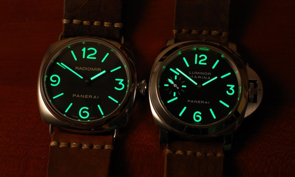 Picture for panerai.com showing that the 210 is a little creamy in the dial text.  Thanks to Meric and Kevin O for pointing this out to me.
__________________
member#3242 |

|

|
|
11 September 2010, 02:50 AM
|
#2 |
|
"TRF" Member

Join Date: Jul 2005
Posts: 22,683
|
Hey, thanks for passing that on.
 Good to know and shows what these forums are all about. Good to know and shows what these forums are all about. Those two guys are extremely knowledgeable indeed.
|
|
|
|
|
11 September 2010, 04:36 AM
|
#3 |
|
"TRF" Member
Join Date: Mar 2007
Real Name: Mik
Location: USA
Posts: 13,723
|
Yeah, there are many minor details in changes with Panerai's that we need to keep up on. Another example is that prior to G the crown guard models didn't have the crown lever perfectly centered. Lots of little details. Stay diligent!

__________________
member#3242 |
|
|
|
|
11 September 2010, 04:58 AM
|
#4 |
|
"TRF" Member

Join Date: Aug 2008
Real Name: Bryan
Location: Oregon
Posts: 7,399
|
Thanks for sharing, Mik!
__________________
Rolex / Panerai / Omega |
|
|
|
|
11 September 2010, 05:03 AM
|
#5 |
|
Member
Join Date: Aug 2010
Real Name: Wes
Location: Brevard, NC/???
Watch: you talkin' 'bout?
Posts: 270
|
Did not know this.
Thanks for sharing! |
|
|
|
|
11 September 2010, 05:18 AM
|
#6 |
|
"TRF" Member

Join Date: Jan 2009
Real Name: Phil
Location: CA
Posts: 5,374
|
hey Mik..I meant to post on the "other forum"
I have found that my 190H dial color is a bit browner than the white on the 312
__________________
too much into watches... |
|
|
|
|
11 September 2010, 08:43 AM
|
#7 |
|
"TRF" Member
Join Date: Nov 2009
Real Name: Bryan
Location: Hong Kong
Posts: 1,577
|
Thanks mfer. Apart from the color I think the thickness of the luminor coating is also different. And that side to side pic between rad and luminor is really interesting. 1 - the font is much bigger on the rad, and 2 - the dial is also much larger in diameter than the Lum. Never new!
__________________
Omega Panerai Chopard Grand Seiko |
|
|
|
|
11 September 2010, 11:50 AM
|
#8 | |
|
"TRF" Member
Join Date: Mar 2007
Real Name: Mik
Location: USA
Posts: 13,723
|
Quote:
 The Radiomir has a much bigger font b/c the case is 1mm bigger than the Luminor and the bezel of the Radiomir is much thinner than the Luminor. This leaves more space for a big clean dial!
__________________
member#3242 |
|
|
|
|
|
11 September 2010, 12:31 PM
|
#9 |
|
"TRF" Member

Join Date: Nov 2009
Real Name: Joe
Location: Hong Kong
Posts: 1,835
|
Great info, Mik! Thx for sharing.
Cheers, Joe
__________________
 "Design is not just what it looks like and feels like. Design is how it works." - S.J. "Design is not just what it looks like and feels like. Design is how it works." - S.J.
|
|
|
|
 |
| Currently Active Users Viewing This Thread: 1 (0 members and 1 guests) | |
|
|


*Banners
Of The Month*
This space is provided to horological resources.


 Linear Mode

