 |
ROLEXROLEXROLEXROLEXROLEXROLEX
 ROLEXROLEXROLEXROLEXROLEXROLEX
|
|
#31 |
|
2024 ROLEX DATEJUST41 Pledge Member
Join Date: Jan 2018
Location: Toronto
Watch: ♕
Posts: 2,006
|
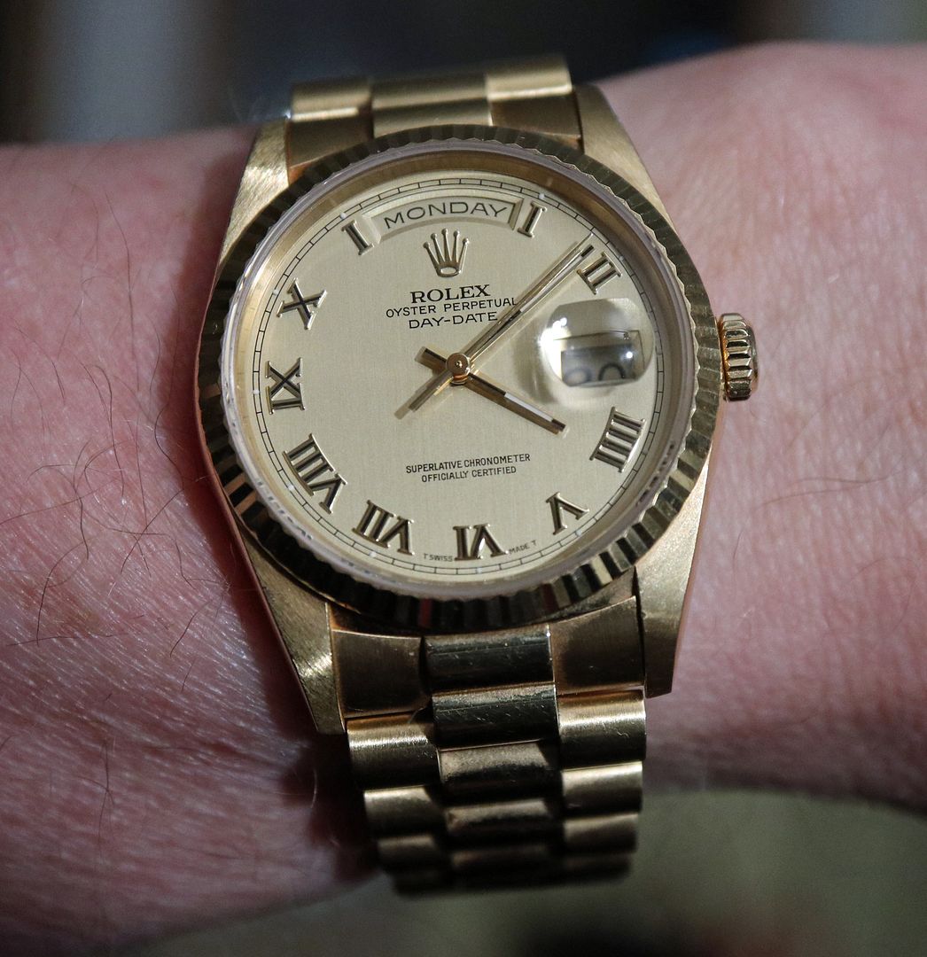
Legibility is fine on my 18238, I specifically wanted the silver dial, was originally interested in the white dial, but it was just a little too "bright" for my liking, silver dial fit the bill perfectly.
Personally, easy to read, quick glance and I get all the info. |
|
|

|
|
|
#32 |
|
"TRF" Member
Join Date: Mar 2017
Location: House
Watch: Explorer II 216570
Posts: 16
|
I was originally concerned about blue dial romans, but I've had mine a few months now and it's not been an issue.
|
|
|

|
|
|
#33 |
|
2024 Pledge Member
Join Date: Aug 2012
Real Name: Lee
Location: 42.48.45N70.48.48
Watch: What's on my wrist
Posts: 33,256
|
I admit that my Champagne dialed can be touch to read in the wrong light and at the wrong angle. It's especially true with the non-ARC cyclops. It's the Day and Date that could use greater contrast; I've thought of switching out the wheels but haven't yet. Never the less I manage to stumble on and get the most out of it!!!

|
|
|

|
|
|
#34 |
|
2024 Pledge Member
Join Date: Jan 2014
Real Name: Bill
Location: Baltimore, MD
Watch: 116600 SD4K
Posts: 3,236
|
Quote:
Im with Lee on this - my champagne on gold OQ is not my most legible watch, but I enjoy it.  However, I have no legibility concerns with my 18239.  I suspect, based on input from others, legibility is less of a concern with modern references and I say go for it. 
|
|
|

|
|
|
#35 |
|
"TRF" Member
Join Date: May 2015
Location: Northern Ontario
Watch: 19018N OQ
Posts: 848
|
Even with an older DD no issues here.

|
|
|

|
|
|
#36 |
|
"TRF" Member
Join Date: Apr 2009
Real Name: Gerardus
Location: EU
Watch: ♕
Posts: 11,909
|

__________________
 ♕16570 ♕126610 ♕126333 |
|
|

|
|
|
#37 |
|
"TRF" Member
Join Date: Jul 2014
Location: Washington, DC
Posts: 5,342
|
Are the hands thicker or more substantial on modern DD references? Hence easier to read?
Sent from my iPad using Tapatalk |
|
|

|
|
|
#38 |
|
"TRF" Member
Join Date: May 2010
Location: Florida
Posts: 2,132
|
I’m going for the DD40 WG with black dial for legibility reasons. Also, these dials look very different in person that they do on Rolex.com. I thought I wanted the rhodium striped dial until I compared it to the black dial. I thought I’d like the black dial with diamonds until I saw it in person.
No wrong answer though!! Buy what YOU like!
__________________
Official Member: 'Perpetual 30' Vegas International GTG 2016 Official Member "WIS-CON" Las Vegas International GTG 2017 |
|
|

|
|
|
#39 |
|
"TRF" Member
Join Date: Sep 2009
Location: Alabama
Posts: 229
|
I recently got the wg DD40 with the olive green dial, and it is stunning! I will say that in different lighting situations, the color changes to different shades, which is great. If you don’t have the best eyesight, the Roman numerals and hands can be hard to read because there is no lume on either with the Roman numeral option.
|
|
|

|
|
|
#40 |
|
"TRF" Member
Join Date: Apr 2012
Location: Las Vegas
Watch: 1680 RED, OP39,PAM
Posts: 192
|
I have the DD40 in yg with white diagonal motif dial, stick lume markers. I'm 50 with reasonably good vision and in certain lighting it can take a few seconds to read the time. The hour and minute hand hand can be hard to differentiate. I love the look but if could have a do over i would probably chose a darker dial with more contrast.
|
|
|

|
|
|
#41 |
|
2024 Pledge Member
Join Date: Jan 2012
Location: NJ, USA
Posts: 629
|
Thanks everyone for your responses. Anecdotally it would seem that the day/date in white gold with a variety of dials is not the greatest in terms of outright legibility! I might have to “keep on truckin’” with my 2-tone sub. LOL
|
|
|

|
|
|
#42 |
|
"TRF" Member
Join Date: Apr 2010
Location: Texas
Posts: 39
|
My favorite!
|
|
|

|
|
|
#43 |
|
"TRF" Member
Join Date: Oct 2005
Location: The UK
Watch: I love them all.
Posts: 1,822
|
__________________
Regards, CharlesN Member of the IWJG. |
|
|

|
|
|
#44 |
|
Banned
Join Date: Apr 2019
Real Name: Mike
Location: San Diego, CA
Watch: Submariner
Posts: 1,197
|
Both 36 and 40mm versions are equally easy to read
Also both blue and green dials have equal legibility |
|
|

|
|
|
#45 |
|
2024 Pledge Member
Join Date: Apr 2013
Location: Indianapolis
Watch: Patek-Philippe
Posts: 16,832
|
__________________
Rolex and Patek Philippe |
|
|

|
 |
| Currently Active Users Viewing This Thread: 1 (0 members and 1 guests) | |
|
|
*Banners
Of The Month*
This space is provided to horological resources.