
|
|
ROLEXROLEXROLEXROLEXROLEXROLEX
 ROLEXROLEXROLEXROLEXROLEXROLEX
 8 December 2012, 04:10 AM
|
#31 |
|
"TRF" Member

Join Date: Aug 2009
Real Name: Mr. H
Location: Dallas
Watch: them for me!
Posts: 7,180
|
I personally like blueish dial on the RG Jumbo. I tried it on a few months ago and loved it. A true grail!!!

__________________
WATCHES ARE THE NEW CURRENCY!/ MEMBER 27491/OFFICIALLY DESIGNATED OLD TIMER /AP OWNERS CLUB MEMBER Instagram @watchcollectinglifestyle 
|

|

|
|
8 December 2012, 04:57 AM
|
#32 | |
|
2024 Pledge Member

Join Date: Jul 2009
Location: Cave
Watch: Sundial
Posts: 33,873
|
Quote:
|
|
|
|
|
|
8 December 2012, 05:05 AM
|
#33 | ||
|
"TRF" Member

Join Date: Jul 2012
Location: Rhode Island
Watch: Batman, Kermit
Posts: 1,081
|
Quote:
Quote:
In addition compared to the 5402, the font used on the dial to say Audemars Piguet is different than what is used to say Audemars Piguet on the 15202. Also, where you said "No roman numerals (to indicate the minutes)..." I believe you meant no Arabic numerals. |
||
|
|
|
|
8 December 2012, 05:18 AM
|
#34 | |
|
2024 Pledge Member
Join Date: Jul 2009
Location: Cave
Watch: Sundial
Posts: 33,873
|
Quote:
|
|
|
|
|
|
8 December 2012, 08:53 AM
|
#35 | |
|
"TRF" Member

Join Date: May 2012
Real Name: Cory
Location: NY
Posts: 681
|
Quote:
|
|
|
|
|
|
8 December 2012, 12:17 PM
|
#36 |
|
Banned
Join Date: Jun 2012
Real Name: Paula
Location: Wyoming USA
Watch: El Primero 10th LE
Posts: 118
|
The blueish dial with the AP at 6 o clock makes this watch my new grail!
|
|
|
|
|
8 December 2012, 01:45 PM
|
#37 |
|
"TRF" Member
Join Date: May 2012
Real Name: Cory
Location: NY
Posts: 681
|
Is the blue dial on the new 15202 noticeably different than the blue dial on the 15300?
|
|
|
|
|
8 December 2012, 03:21 PM
|
#38 | |
|
2024 Pledge Member
Join Date: Jul 2009
Location: Cave
Watch: Sundial
Posts: 33,873
|
Quote:
|
|
|
|
|
|
8 December 2012, 11:35 PM
|
#39 | |
|
"TRF" Member
Join Date: Aug 2009
Real Name: Mr. H
Location: Dallas
Watch: them for me!
Posts: 7,180
|
Quote:
Sent from my iPad using Tapatalk.
__________________
WATCHES ARE THE NEW CURRENCY!/ MEMBER 27491/OFFICIALLY DESIGNATED OLD TIMER /AP OWNERS CLUB MEMBER Instagram @watchcollectinglifestyle
|
|
|
|
|
|
9 December 2012, 01:53 AM
|
#40 |
|
"TRF" Member
Join Date: May 2012
Real Name: Cory
Location: NY
Posts: 681
|
is it just the smaller pattern, or the color and shine too?
|
|
|
|
|
9 December 2012, 02:28 AM
|
#41 | |
|
"TRF" Member
Join Date: Aug 2009
Real Name: Mr. H
Location: Dallas
Watch: them for me!
Posts: 7,180
|
Quote:
__________________
WATCHES ARE THE NEW CURRENCY!/ MEMBER 27491/OFFICIALLY DESIGNATED OLD TIMER /AP OWNERS CLUB MEMBER Instagram @watchcollectinglifestyle
|
|
|
|
|
|
9 December 2012, 05:24 AM
|
#42 | |
|
"TRF" Member

Join Date: Feb 2009
Real Name: TSW
Location: Le Brassus
Watch: Rolex & AP's
Posts: 27,449
|
Quote:

__________________
 AP Owners Club IG @swiss.watch.connection |
|
|
|
|
|
9 December 2012, 02:34 PM
|
#43 | |
|
"TRF" Member
Join Date: Jul 2012
Location: Rhode Island
Watch: Batman, Kermit
Posts: 1,081
|
Quote:
|
|
|
|
|
|
26 December 2012, 11:48 PM
|
#44 | |
|
"TRF" Member
Join Date: Sep 2009
Location: NY
Posts: 92
|
Quote:
Thank you very much for your time. gb |
|
|
|
|
|
27 December 2012, 02:50 AM
|
#45 | |
|
2024 Pledge Member
Join Date: Jul 2009
Location: Cave
Watch: Sundial
Posts: 33,873
|
Quote:
  
|
|
|
|
|
|
27 December 2012, 03:00 AM
|
#46 | |
|
"TRF" Member
Join Date: Jul 2012
Location: Rhode Island
Watch: Batman, Kermit
Posts: 1,081
|
Quote:
The clasps on Royal Oak Ultrathins were not a butterfly style until 2012. However, I did not like the last few designs they did. I think their original stamped steel design (as made by GF) was their most comfortable single blade clasp. I did not care for the designs offered from say 2000-2011. Although the ones with the "AP" letters as part of the design were elegant I never thought it was very comfortable and I never liked the spring button closure. The new clasp is very comfortable and the watch sits right on the center of my wrist. Its probably one of the best butterfly designs I've worn. I do not believe the current clasp is thinner than what is on other ROs, but didn't actually compare the clasps to check for thickness. |
|
|
|
|
|
27 December 2012, 05:12 AM
|
#47 |
|
"TRF" Member

Join Date: May 2011
Location: Well, um....
Watch: Depends on the day
Posts: 149
|
I'll say this--the spring button closure is less secure than I would like. The foldover probably wouldn't work on a heavier, thicker piece but to me its part of the extra allure of the Jumbo.
 Oh yeah, and there's that, too 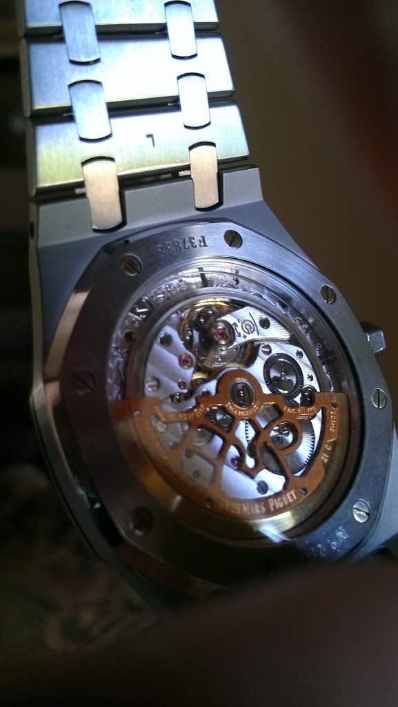 They changed the rotor a little, but in either iteration, a thing of beauty. I will try to stop by the AD here and compare the new and mine, though I admit I want to see the 41mm. I love my 15202, but as our office has gone casual, I have to at least consider the larger one, probably better with polos. |
|
|
|
|
27 December 2012, 06:10 AM
|
#48 |
|
2024 Pledge Member
Join Date: Jul 2009
Location: Cave
Watch: Sundial
Posts: 33,873
|
New rotor

|
|
|
|
|
27 December 2012, 10:27 AM
|
#49 |
|
Member
Join Date: Nov 2012
Location: Norway
Posts: 56
|
The 15202 has rounded indexes/hour markers, amongst other things. Even if this is the original Genta design I find the hour markers with facets to give the watch more of a presence, especially in bright light/sunlight.
The fact that the 15300/400 costs quite a lot less, and has an in-house movement, as opposed to the 15202, I would think it over more than once before buying the 15202. But by all means, the 15202 is a fantastic watch, and if I had the money I would probably buy that as well :-) |
|
|
|
|
27 December 2012, 10:33 AM
|
#50 | |
|
Banned
Join Date: Oct 2009
Real Name: Ad Rock
Location: Manhattan
Posts: 621
|
Quote:
If I ever decide to get a Jumbo with an AP at six, it's gonna be an A-series. Regards, Adam |
|
|
|
|
|
27 December 2012, 04:35 PM
|
#51 |
|
"TRF" Member

Join Date: Aug 2010
Real Name: Wayne
Location: Singapore
Watch: AP, PP, Rolex
Posts: 1,791
|
So rich of information regarding the AP RO jumbo in this thread! I think it should be made a sticky
I've handled several versions of the jumbo, new and old, and I concur with all the comments here regarding the size, appearance, wearing comfort, etc comparing the different generations and also other more modern models such as the 15300 & 15400. In a nutshell, all ROs are special. Although one may wear slightly differently from another, they are all winners in their own rights. 5402 - Its 7mm "thick" case with solid case back is the slimmest. The legendary 2121 movement is concealed within the monocoque watch case. Agreed that the GF clasp is very comfortable but the older bracelet design has very limited removable links and it only suits larger wrist size. It didn't fit very well on my 6.75" wrist. The entire watch, while look sporty, does feel a little fragile due to the thin case and very thin bracelet. But it looks darn good on the wrist. The original dial with the double-stick 12 o'clock marker and the AP logo at 6pm is the most iconic jumbo dial, and the nicest of all.   14802 (Jubilee) - The first 8mm case with display case back exposing the amazing 2121 movement. The clasp is now single-fold. The plain rectangular shape clasp is very comfortable as there is no protruding edges like the newer AP logo single-fold clasp. For a smaller wrist like mine, I swap the orientation of the clasp to achieve better wearing comfort. The petite tapisserie dial is equally mesmerising as the original 5402.    15202 (pre-2012) - Same case size as 14802. Major design change in the dial, rotor engraving, and sporting the new AP logo single-fold clasp. With the shorter hour markers, arabic numbering on the outer ring, white box around the date aperture and the grand tapisserie dial, the entire watch looks even more sportier. The 3 dial colours (charcoal, slate-blue and white) offer good choices. The AP logo clasp doesn't wear as comfortable but it sure is elegant. The engraving of the rotor is tasteful.   15202 (2012) - As many have put, it is as close to the original as you can get for the jumbo. We see the return of double-stick 12 o'clock marker and AP@6, as well as the famed petite-tappiserie dial. The blue dial has a new shade of blue which is not quite near the original. I still feel the original dial colour is somewhat mysterious and more attractive. The little squares on the dial seem to be spaced a little far apart from each other compared to the original petite tapisserie dial. The font used is also changed. The result is a more modern and technical feel as opposed to the more classical feeling of the original design. The dark-blue date wheel with white numbering is however a welcomed detail which adds to the cohesiveness of the entire dial. The new rotor engraving is nice but feels more "industrial" compared to the previous model. The bracelet has been reworked with thicker size (same size or "flushed" with the lug-end of the watch case... previous model has a bracelet thinner than the lug). The clasp is now an enhanced butterfly clasp. The new bracelet has somehow given this revised jumbo a much bolder presence than the previous models, and it does give a more solid feeling in the hand.    How about the 15300 and 15400? With the in-house 3120 movement, they come with a slightly thicker watch case and thicker bracelet. These add to a more substantial feeling and a bolder wrist presence compared to the jumbos. The modern models also have 60hr power reserve (as compared to the 38hr on the jumbo), quick-set date and second hand, which provide convenience and a sense of interaction assuring the wearer that the watch is ticking! As for 39mm vs 41mm, my take is that there is no real pros and cons here, it only depends on individual preference of size. As a matter of fact, the design of the RO's integrated steel bracelet makes the entire watch wears like a... bracelet. I think any size from 33mm - 44mm would look great on the wrist as long as the watch matches the apparel and style. A pvd-ed 15300. Not the best example... but it's kinda cool..  15400. The bigger case size wears quite balanced on my 6.75" wrist. The new bracelet allows more room for adjustment too. (The bracelet in the photo has not been adjusted).  A quick shot of my wife's Lady RO on my wrist!  Not really out of place though in terms of size except for the diamonds... Not really out of place though in terms of size except for the diamonds... Hope these info and experience of mine is helpful for the discussion and for anyone who has yet to firm up his/her mind for a Royal Oak 
|
|
|
|
|
27 December 2012, 10:50 PM
|
#52 |
|
2024 Pledge Member
Join Date: Jul 2009
Location: Cave
Watch: Sundial
Posts: 33,873
|
very well written Wayne! That PVD 15300 is very interesting.
|
|
|
|
|
27 December 2012, 11:44 PM
|
#53 | |
|
"TRF" Member
Join Date: Aug 2009
Real Name: Mr. H
Location: Dallas
Watch: them for me!
Posts: 7,180
|
Quote:
 Sent from my iPhone using Tapatalk. Watches are the new currency!
__________________
WATCHES ARE THE NEW CURRENCY!/ MEMBER 27491/OFFICIALLY DESIGNATED OLD TIMER /AP OWNERS CLUB MEMBER Instagram @watchcollectinglifestyle
|
|
|
|
|
|
28 December 2012, 12:42 AM
|
#54 |
|
Member
Join Date: Nov 2012
Location: Malaysia
Posts: 126
|
15202
My 15202 says hi :)

|
|
|
|
|
28 December 2012, 01:11 AM
|
#55 |
|
"TRF" Member

Join Date: May 2012
Location: Sarajevo
Posts: 1,824
|
Great post orangedial
|
|
|
|
|
28 December 2012, 03:30 AM
|
#56 |
|
"TRF" Member
Join Date: Sep 2009
Location: NY
Posts: 92
|
Thank you very much Mike (congratulations on your new watch!), Dino944, Scott, Adam and Wayne for the excellent explanation. Thank you all for your time.
I am used to and find comfortable the rectangular clasp below. I have not tried the AP logo one but I can appreciate Wayne's concerns. Can the AP logo be swapped for the rectangular one? With respect to the butterfly clasp, I personally find that it is a little bulky underneath the wrist to the point of being uncomfortable. Well, is probably all a matter of personal preferences. All the best, gb |
|
|
|
|
28 December 2012, 05:21 AM
|
#57 | |
|
"TRF" Member
Join Date: Jul 2012
Location: Rhode Island
Watch: Batman, Kermit
Posts: 1,081
|
Quote:
|
|
|
|
|
|
28 December 2012, 07:52 AM
|
#58 | |
|
Banned
Join Date: Oct 2009
Real Name: Ad Rock
Location: Manhattan
Posts: 621
|
What a pic!
Quote:
 Regards, Adam |
|
|
|
|
|
28 December 2012, 07:55 AM
|
#59 |
|
"TRF" Member
Join Date: Feb 2009
Real Name: TSW
Location: Le Brassus
Watch: Rolex & AP's
Posts: 27,449
|
Talk about a enabling thread
__________________
AP Owners Club IG @swiss.watch.connection |
|
|
|
|
28 December 2012, 09:01 AM
|
#60 |
|
2024 Pledge Member
Join Date: Jul 2009
Location: Cave
Watch: Sundial
Posts: 33,873
|
Gorgeous watch!

|
|
|
|
 |
| Currently Active Users Viewing This Thread: 1 (0 members and 1 guests) | |
|
|


*Banners
Of The Month*
This space is provided to horological resources.


 Linear Mode

