
|
|
ROLEXROLEXROLEXROLEXROLEXROLEX
 ROLEXROLEXROLEXROLEXROLEXROLEX
 24 August 2018, 07:41 PM
|
#1 |
|
"TRF" Member
Join Date: Mar 2014
Location: With my suitcase
Posts: 44
|
Fat font insert identification
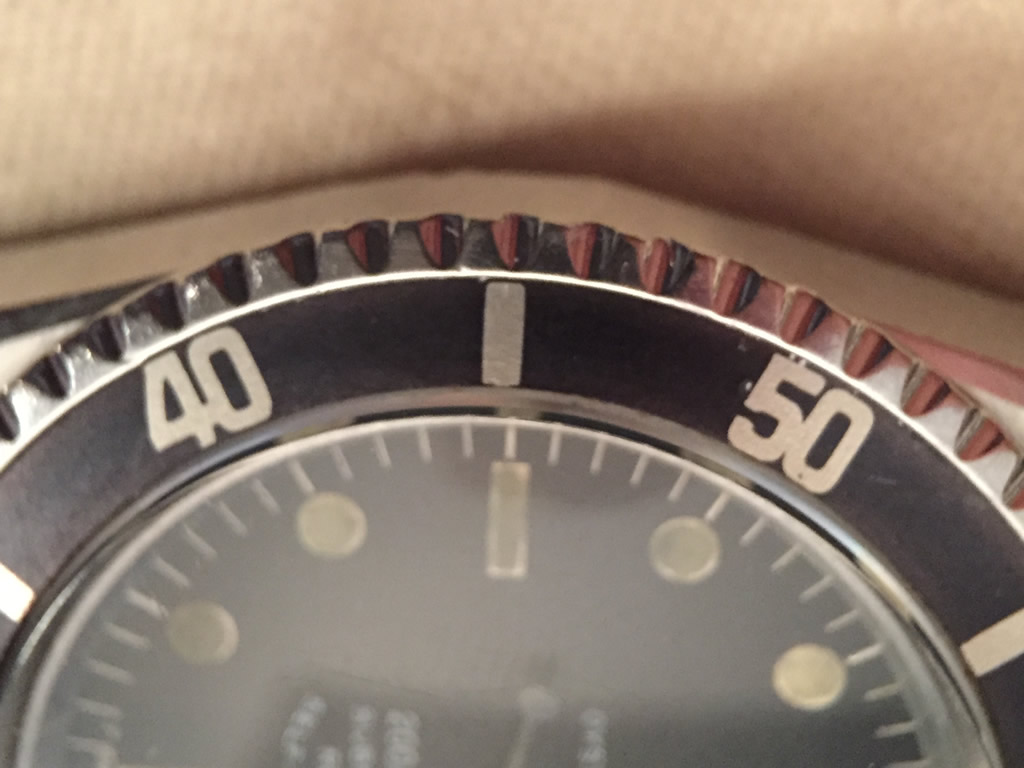
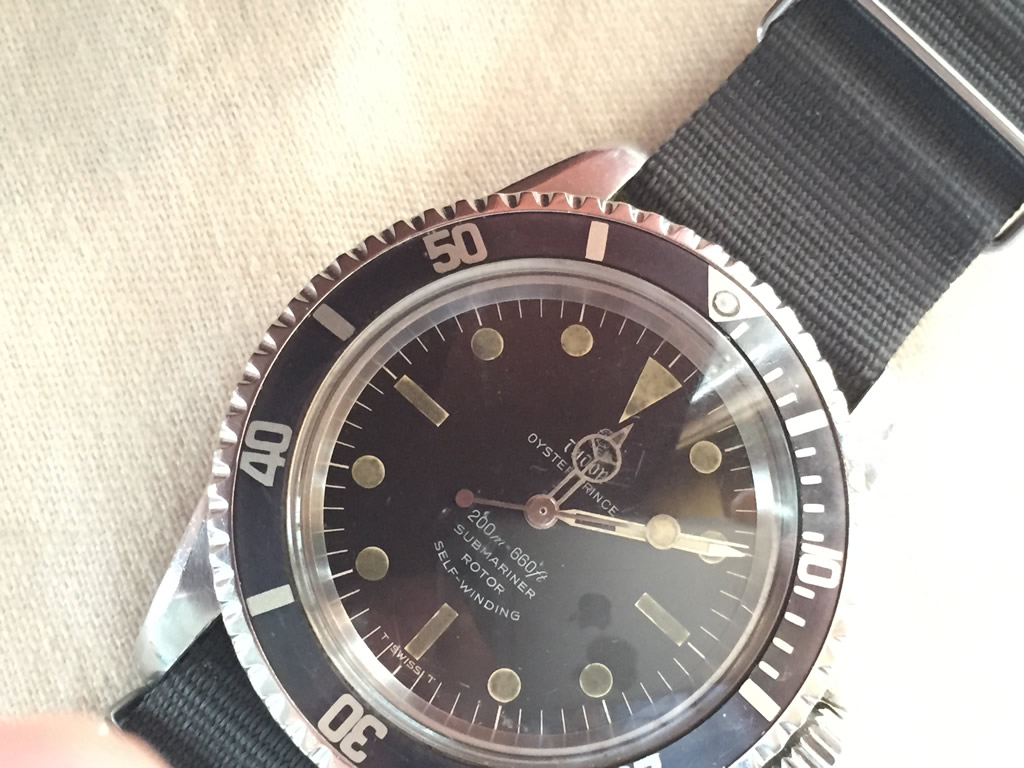
Hi fellow members, I bought this insert locally, what you guys think? Should I be concern about the color bleed on the fonts?
I have the option to return it if it's not genuine.   
|

|

|
|
24 August 2018, 09:00 PM
|
#2 |
|
"TRF" Member
Join Date: Feb 2014
Location: England
Posts: 518
|
Almost looks like someone’s painted it to me.
Be interested to see what the experts say, good luck! |
|
|
|
|
24 August 2018, 09:18 PM
|
#3 | |
|
"TRF" Member

Join Date: Jul 2008
Real Name: Charles
Location: Montreal, QC
Watch: 1680 Red, 116710
Posts: 359
|
Quote:
__________________
1972 1680 SUB 2018 116710 BLNR 2005 Citizen Skyhawk C651 |
|
|
|
|
|
24 August 2018, 09:25 PM
|
#4 |
|
"TRF" Member

Join Date: Apr 2016
Real Name: Morningtundra
Location: USA, UK & HKG
Posts: 1,037
|
I think its been repainted.
Sent from my cracked, broken hand wound phone. IG @morning_tundra |
|
|
|
|
25 August 2018, 03:39 AM
|
#6 | |
|
"TRF" Member
Join Date: Apr 2016
Real Name: Morningtundra
Location: USA, UK & HKG
Posts: 1,037
|
Quote:
What about the scratches/gouges next to the 20? Sent from my cracked, broken hand wound phone. IG @morning_tundra |
|
|
|
|
|
25 August 2018, 03:44 AM
|
#7 |
|
Banned
Join Date: Aug 2015
Location: USA
Posts: 2,030
|
I’ve never seen another Insert with such jagged borders on the Numbers.
|
|
|
|
|
25 August 2018, 04:02 AM
|
#8 |
|
"TRF" Member
Join Date: Jul 2013
Real Name: Sam
Location: los Angeles
Posts: 2,051
|
Rolex QC in the late 60s can leave something to b desired. This should have been discarded. But its the correct font, so its definitely legit.
I blame it on autoconnect. |
|
|
|
|
25 August 2018, 04:14 AM
|
#9 |
|
2024 Pledge Member

Join Date: Aug 2010
Location: .
Watch: on my wrist
Posts: 1,942
|
How do those jagged edges look under a loupe? Is the color uniform?
|
|
|
|
|
25 August 2018, 10:26 AM
|
#10 | ||
|
"TRF" Member
Join Date: Mar 2014
Location: With my suitcase
Posts: 44
|
Quote:
Quote:
|
||
|
|
|
|
25 August 2018, 10:41 AM
|
#11 | |
|
"TRF" Member
Join Date: Mar 2014
Location: With my suitcase
Posts: 44
|
Quote:
Honestly I'm afraid to put my watch under a loupe now. |
|
|
|
|
|
25 August 2018, 10:45 AM
|
#12 |
|
Banned
Join Date: Aug 2015
Location: USA
Posts: 2,030
|
 I have this Insert that I think was caused by a worn printing pad and it looks nothing like the OPs.Mine looks blurry and the numbers are extra fat,No jagged borders. |
|
|
|
|
25 August 2018, 11:46 AM
|
#13 |
|
"TRF" Member
Join Date: Mar 2014
Location: With my suitcase
Posts: 44
|
More macros for discussion
  
|
|
|
|
|
25 August 2018, 12:33 PM
|
#14 |
|
"TRF" Member

Join Date: Sep 2014
Real Name: Jim
Location: Connecticut
Watch: this! Hold my beer
Posts: 2,813
|
It’s just an aluminum ring!
I think it was the very last one ever made. The pad and pad maker were BOTH thrown out after this run. I think it’s genuine. I’ve not seen any aftermarket one look that “rough” around the edges. |
|
|
|
|
25 August 2018, 12:47 PM
|
#15 | |
|
"TRF" Member
Join Date: Mar 2014
Location: With my suitcase
Posts: 44
|
Quote:
|
|
|
|
|
|
25 August 2018, 12:59 PM
|
#16 | |
|
Banned
Join Date: Aug 2015
Location: USA
Posts: 2,030
|
Quote:
EDIT:Are there tiny bumps on the Insert under the jagged edges? It almost looks like an uneven surface on the Insert could have caused the pad to leave rough edges behind.Notice the Black filled in Craters by the “20” in the First Photo. |
|
|
|
|
|
25 August 2018, 01:04 PM
|
#17 |
|
"TRF" Member
Join Date: Jul 2013
Real Name: Sam
Location: los Angeles
Posts: 2,051
|
Ive seen worst.
 After seeing the later pics, I think they r just scratches. Im sure with naked eyes, it looks fine. |
|
|
|
|
25 August 2018, 01:13 PM
|
#18 | |
|
"TRF" Member
Join Date: Mar 2014
Location: With my suitcase
Posts: 44
|
Quote:
The crater is caused by me. I tried to install the insert using a metal plier, left some nasty scratches and almost dented the insert  . Lesson learnt. . Lesson learnt.
|
|
|
|
|
|
25 August 2018, 01:18 PM
|
#19 |
|
"TRF" Member
Join Date: Sep 2014
Real Name: Jim
Location: Connecticut
Watch: this! Hold my beer
Posts: 2,813
|
The bumps look like the “suede” blue Tudor inserts which also command silly money.
But to be fair, the right insert makes the watch. But if I’m paying mortgage pay money for a gram of aluminum, I want it looking new, not dead! |
|
|
|
|
25 August 2018, 08:01 PM
|
#20 | |
|
"TRF" Member

Join Date: Jan 2008
Real Name: Jeff
Location: Toronto
Posts: 1,947
|
Quote:
Beautiful looking genuine insert. Correct font, just as others have said printed with a worn pad. If you dont want it, Ill buy it from you. Enjoy that vintage beauty! Jeff |
|
|
|
|
|
26 August 2018, 01:01 AM
|
#21 | |||
|
2024 ROLEX DATEJUST41 Pledge Member

Join Date: Dec 2011
Location: RedSox Nation
Watch: U Talkn Bout Wilis
Posts: 5,425
|
It's fine ; ) It is just a bleeder
 Quote:
 Quote:
Old and Sloppy - wish I still had this one ; ) 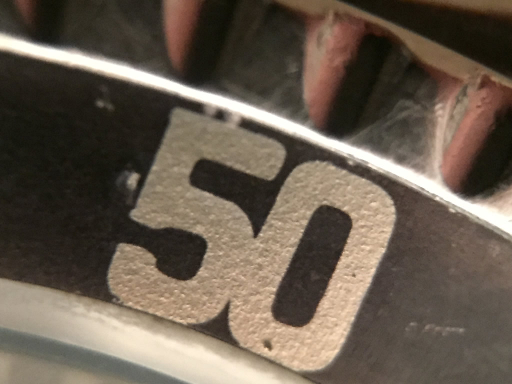
__________________
I'm a sailor peg. And I've lost my leg. Climbing up the top sails. I've lost my leg! |
|||
|
|
|
|
26 August 2018, 01:08 AM
|
#22 | |
|
"TRF" Member

Join Date: Feb 2015
Location: Virginia
Posts: 1,002
|
Quote:
I guess you cant return it if you scratched it up!! But Id keep it bc it looks great!! ------ Instagram: @mattedialdoc |
|
|
|
|
|
26 August 2018, 01:14 AM
|
#23 |
|
"TRF" Member
Join Date: Jul 2013
Real Name: Sam
Location: los Angeles
Posts: 2,051
|
Old and Sloppy - wish I still had this one ; )
[/QUOTE]The donut insert, such a beauty. Show us the 40, John.  I blame it on autoconnect. |
|
|
|
|
26 August 2018, 02:19 AM
|
#24 | |
|
2024 ROLEX DATEJUST41 Pledge Member
Join Date: Dec 2011
Location: RedSox Nation
Watch: U Talkn Bout Wilis
Posts: 5,425
|
Quote:
__________________
I'm a sailor peg. And I've lost my leg. Climbing up the top sails. I've lost my leg! |
|
|
|
|
|
26 August 2018, 02:04 PM
|
#25 |
|
"TRF" Member
Join Date: Mar 2014
Location: With my suitcase
Posts: 44
|
Thanks for sharing guys
|
|
|
|
|
26 August 2018, 07:28 PM
|
#26 |
|
"TRF" Member
Join Date: Sep 2012
Location: Japan
Posts: 4,344
|
Shun the paranoia. It's a beauty.
|
|
|
|
 |
| Currently Active Users Viewing This Thread: 1 (0 members and 1 guests) | |
|
|


*Banners
Of The Month*
This space is provided to horological resources.


 Linear Mode

