
|
|
ROLEXROLEXROLEXROLEXROLEXROLEX
 ROLEXROLEXROLEXROLEXROLEXROLEX
 25 November 2014, 06:04 AM
|
#1 |
|
"TRF" Member
Join Date: Sep 2014
Location: Usa
Posts: 11
|
Tudor sub "fat" font m/ft
Hi All,
I have been noticing a discrepancy on the M/FT font on a few Tudor subs, and was wondering if the experienced can explain why some appear to be "fat" whilst others (at least to my eyes) appear much clearer. I don't believe that this is simply better photography, and am curious to know if this is a red flag or if it has a legitimate explanation. For example, see below: |

|

|
|
25 November 2014, 08:13 AM
|
#2 |
|
2024 ROLEX DATEJUST41 Pledge Member

Join Date: Dec 2011
Location: RedSox Nation
Watch: U Talkn Bout Wilis
Posts: 5,442
|
Need better photos, those are not sharp enough to see well. They are fuzzy enough on one spot not to see something I expect to see. Also helps to know WHICH Tudor sub you are talking about. But above is not a 7928 or Mercedes 7016, which model later?
7016 & 94110 (there are several variants)  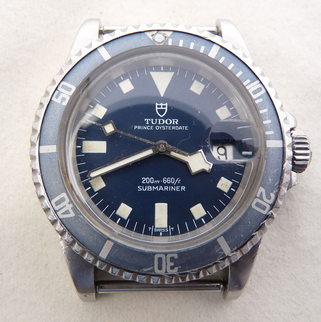
__________________
I'm a sailor peg. And I've lost my leg. Climbing up the top sails. I've lost my leg! |
|
|
|
|
25 November 2014, 11:08 AM
|
#3 |
|
"TRF" Member
Join Date: Sep 2014
Location: Usa
Posts: 11
|
Sorry , they are in 79090 dials. Thx
|
|
|
|
|
27 November 2014, 01:35 AM
|
#4 |
|
"TRF" Member

Join Date: Dec 2008
Location: Boston
Posts: 862
|
I've never noticed a difference in 79090 or 76100 fonts. Just the snowflakes and the 7016's
__________________
Formerly John in SC and John in TN How To: Remove a Tudor Pelagos Endlink in 60 Seconds or Less |
|
|
|
 |
| Currently Active Users Viewing This Thread: 1 (0 members and 1 guests) | |
|
|


*Banners
Of The Month*
This space is provided to horological resources.


 Linear Mode

