 |
ROLEXROLEXROLEXROLEXROLEXROLEX
 ROLEXROLEXROLEXROLEXROLEXROLEX
|
|
#1 |
|
"TRF" Member
Join Date: Mar 2012
Location: Houston, Tx
Posts: 147
|
5711/1a Dial Discrepancies
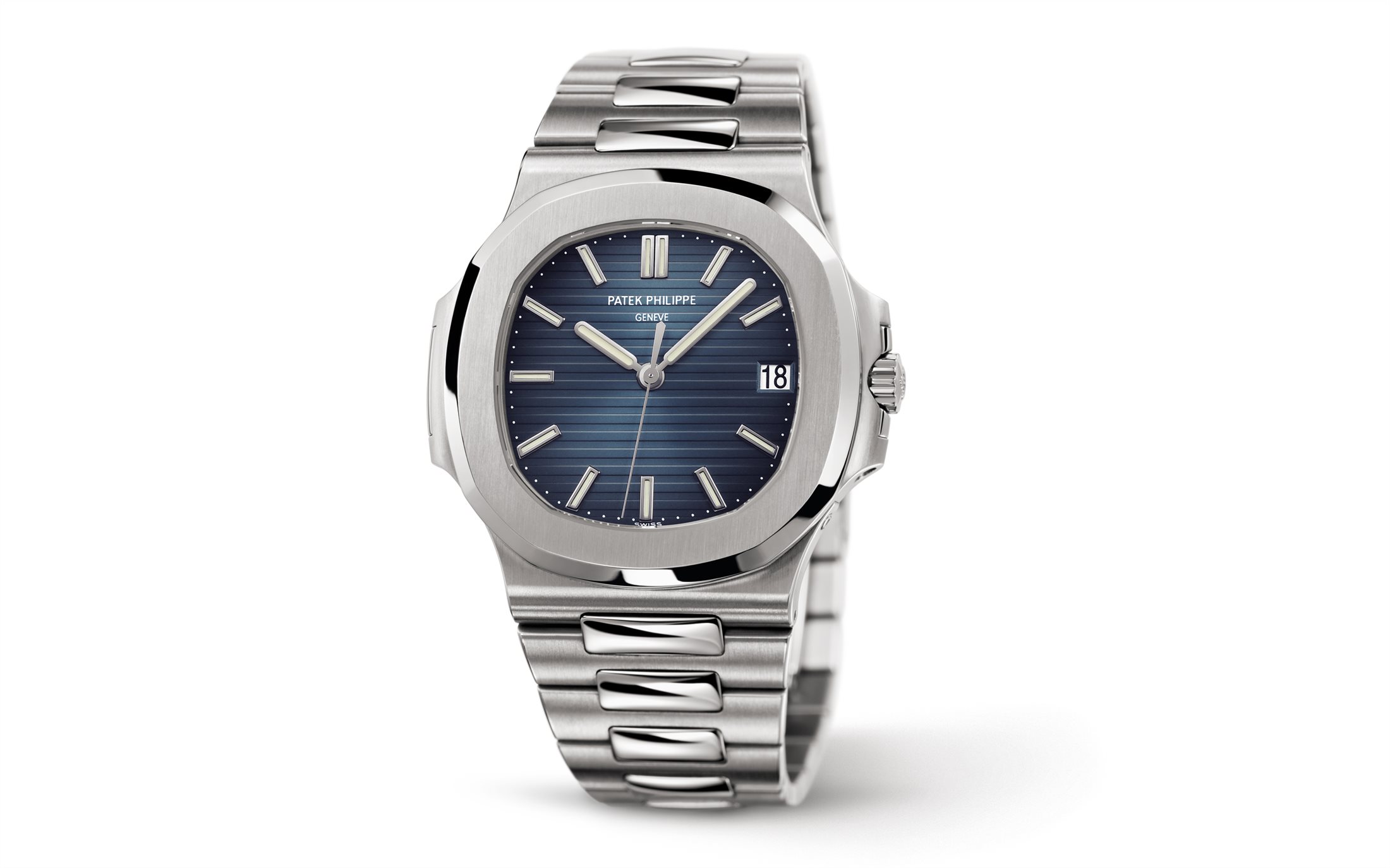
Hi everyone, I found an interesting discrepancy in how "Patek Philippe" and "Geneve" are displayed on the blue dial of a 5711/1a. Please see the links below:
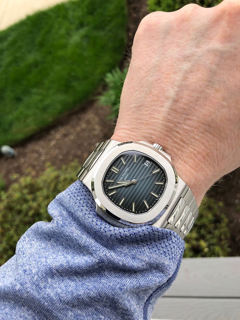
1) https://www.patek.com/en/collection/...#&gid=1&pid=11 2) https://www.patek.com/en/collection/...0#&gid=1&pid=8 If the links do not work correctly, see below: 1)  2)  Both images are found in the image reel for the Nautilus but I noticed the first has the brand and Geneve written on their own raised platform atop the gutter portions whereas the second image shows the letters are on the raised portions of the gutter and in line with the dial. I have noticed the new 50th Anniversary in platinum does what #1 shows. I was wondering if one of the knowledgeable forum members here can shed light on the dial variation and when this change in dial configuration came out. I have only seen one blue 5711 in the flesh, and I believe it was like the second picture. Thanks! |
|
|

|
|
|
#2 |
|
"TRF" Member
Join Date: Jul 2012
Location: California
Posts: 398
|
The first picture is the new style that is being rolled out this year. The website is a bit of a hot mess right now in terms of mixing both variants in their product shots.
|
|
|

|
|
|
#3 |
|
"TRF" Member
Join Date: Dec 2012
Location: Asia
Posts: 317
|
|
|
|

|
|
|
#4 |
|
"TRF" Member
Join Date: Feb 2016
Location: Belgium
Posts: 403
|
Like new style better
|
|
|

|
|
|
#5 |
|
TRF Moderator & 2024 DATE-JUST41 Patron
Join Date: Dec 2007
Real Name: Ken
Location: SW Florida
Watch: One on my wrist.
Posts: 63,384
|
New one on my wrist. I have not seen another one here yet but I am sure we will soon enough.

__________________
 SPEM SUCCESSUS ALIT |
|
|

|
|
|
#6 |
|
"TRF" Member
Join Date: Jun 2012
Location: Canada
Watch: PP 5320G
Posts: 1,258
|
Is the clasp also different on the newer models or just the dial? My 5711 clasp always annoyed me compared to like a Royal Oak.
|
|
|

|
|
|
#7 | |
|
TRF Moderator & 2024 DATE-JUST41 Patron
Join Date: Dec 2007
Real Name: Ken
Location: SW Florida
Watch: One on my wrist.
Posts: 63,384
|
Quote:

__________________
 SPEM SUCCESSUS ALIT |
|
|
|

|
|
|
#8 |
|
"TRF" Member
Join Date: Jun 2012
Location: Canada
Watch: PP 5320G
Posts: 1,258
|
|
|
|

|
|
|
#9 |
|
Banned
Join Date: Nov 2012
Location: US
Watch: Gilt
Posts: 1,592
|
|
|
|

|
|
|
#10 |
|
"TRF" Member
Join Date: Jan 2011
Real Name: gus
Location: East Coast
Watch: APK & sometimes Y
Posts: 25,987
|
Kind of prefer the old school style with printing on the lines... very minor detail but we are WIS, isn't it all about the details :)

__________________

|
|
|

|
|
|
#11 |
|
"TRF" Member
Join Date: Mar 2012
Location: Houston, Tx
Posts: 147
|
I agree with Subtona. No idea why, I just seem to like that design a little more. But if any of you fine folks want to offer me the new style, I promise I won't complain haha!
I guess that is part of being a WIS, it is all about the details :) |
|
|

|
|
|
#12 |
|
"TRF" Member
Join Date: Feb 2015
Location: Stratosphere
Posts: 1,990
|
5711/1a Dial Discrepancies
|
|
|

|
 |
| Currently Active Users Viewing This Thread: 1 (0 members and 1 guests) | |
| Thread Tools | |
| Display Modes | |
|
|
*Banners
Of The Month*
This space is provided to horological resources.